Taxes are the price we pay for civilization.
– Oliver Wendell Holmes, Jr.
“Those of us who believe that government has reached a size where it threatens to become our master,” wrote Milton Friedman in 1967, “should therefore (1) oppose any tax increase; (2) press for expenditure cuts; (3) accept large deficits as the lesser of evils…”1 America’s national debt stands at over $28 trillion in 2021. That’s >$85,000 owed by every American.2
Milton won. The GOP and the #trickledownfaithful congregation have followed Friedman’s prescription to a T since 1980, and added a PR twist for good measure along the way: the only time they feign concern about America’s massive and growing national debt is when Democrats and liberals hold the reins of power. Otherwise, it’s lifted rug, meet broom, and disinterested yawns all day long. The #trickledownfaithful’s hypocrisy on the deficit is as rote as it is colossal.
This wasn’t always how America operated. As mentioned in chapter four, GOP lawmakers voted down a proposed tax cut by the Kennedy administration in the 1960s on the grounds that the legislation would push the federal budget too far into the red. Those types of Republicans are long gone. The supersizing of the national debt has certainly been a bipartisan effort in the past half century, but only one half of America’s political duopoly has treated the issue completely disingenuously and as a purely partisan football.
The vast majority of Democratic, Republican, independent and third-party voters and legislators agreed in the heyday of the S-C-P era that paying off the debt was a critical national priority. The U.S. accrued big debts during World War II. The national debt to GDP ratio spiked to >100% between 1945 and 1947.3 Both major parties agreed that paying down this debt after the war ended was essential. Corporate and personal taxes were raised to unprecedented heights at the time to do that (see chapter 3’s figures 17 and 18), and federal belt-tightening measures were also adopted to reduce outlays (many of FDR’s New Deal programs were wound down). By the end of the 1950s, America’s debt to GDP ratio had dropped to a much more manageable ~54%. It declined further to 35% by the end of the ‘60s and to ~31% by the end of the ‘70s.
Then the deficit tide started to turn. By the end of the 1980s, America’s debt to GDP ratio had risen to 51%. There was much consternation and hand-wringing over this reversal. George H. W. Bush bit the bullet and raised taxes to pull the ship of state back in the S-C-P era’s direction regarding deficits and the debt.4 Those tax hikes weren’t quite enough. By the end of the ‘90s, the debt to GDP ratio had ticked up to 59%, despite significant economic growth during the Clinton years that pushed the federal books back into surpluses.
By 2010, once the Bush-Cheney administration’s tax cuts had again proven the #supplysidefaithful’s “Laffer Curve” rationale for cutting taxes utterly false, the debt to GDP ratio had ballooned to 91%.5 In 2020, this figure hit 129% – higher than the debt to GDP ratio that the U.S. had during World War II (and which induced a bipartisan response that reversed this trend for well over a generation thereafter).6 Thus far in the 2020s, America hasn’t come close to turning the ship of state far enough policy-wise to turn the tide on the deficit.
If Americans really want to begin chipping away at the national debt in the 2020s – a mighty big if – then a pragmatic follow-on question becomes, “What did America do between 1950 and 1980 that caused the debt to GDP ratio to fall and what would it take moving forward to move the nation in that same direction?” Answering this pair of linked questions requires (1) an objective review of what’s happened to U.S. taxes since 1970; (2) a review what’s happened to federal government spending since 1970; (3) a sober evaluation of whether taxes need to go up – and if so, which elements of society can and should shoulder the vast majority of this additional burden – or whether government spending needs to go down – and if so, which parts of the federal budget should be cut, modified or axed – or if both will be necessary to push the debt to GDP ratio back in a negative direction. These vast and politically charged issues will be the main foci of this subsection.
Let’s begin with the tax issue. Refreshing chapter 3’s figures 17 and 18 since 1970 is a good place to start. America’s nominal personal income tax rates in the highest, middle and lowest brackets are shown in figure 30 from 1970 through 2020. As can be seen, the basic trends are convergence and decline. In 1970, the nominal income tax rate in the highest bracket was 70% versus 14% in the lowest bracket. Twenty-five years later, in 1995, these rates stood at 39.6% and 15%. Another 25 years later, in 2020, they were 37% and 10%.7 The top bracket fell by almost half in this period and the lowest bracket dropped 4%. That’s the definition of increasing regressivity.
The long-term capital gains rate is shown in figure 30’s blue line as well. This rate dropped from 32.2% in 1970, to 29.2% in ’95, and then to 20% in in 2020.8 Let’s copy and paste that increasing regressivity take.
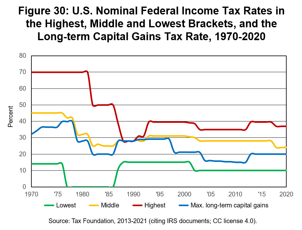
Figure 30 illustrates a major piece of the #unholyunion’s win streak. The federal government collects less money today from America’s wealthiest households and the investor class, relatively, than it did in 1970. The #unholyunion got its way. Figure 30 is an excellent visualization of supply-side economics in practice. The decline in personal income tax rates and in progressivity has been a massive change in U.S. tax dynamics and #unholyunion forces have consistently backed those changes.
Let’s shift to the corporate side of the ledger and see who’s come out ahead on that front. Figure 31 shows the top nominal tax rate for U.S. corporate incomes between 1970 and 2020. This rate dropped from 49.2% to 21% in this timeframe.9 The top rate fell by more than half. That means the amount of money coming into the federal government fell, relatively, from a corporate angle. Let’s copy and paste again.
Nominal tax rate changes don’t tell the full story, of course. Effective tax rates are where the rubber meets the road. The yellow line in figure 31 shows the effective corporate income tax rate from 1970 through 2020. This rate has consistently come in below the top nominal rate. As chapter three noted, this gap exists because SMBs have historically faced lower nominal rates than big businesses, more small businesses have adopted the S Corporation form (and S Corporations pass through profits to be taxed at the individual/owner level and so don’t contribute to effective federal corporate taxes), and because tax shelters, loopholes and deductions have become larger and more pervasive in the corporate tax code. The effective corporate tax rate has fallen from >40% in the early 1950s, to 33% in 1970, 25% in ’95, and 10% in 2020.10 Copy, paste.
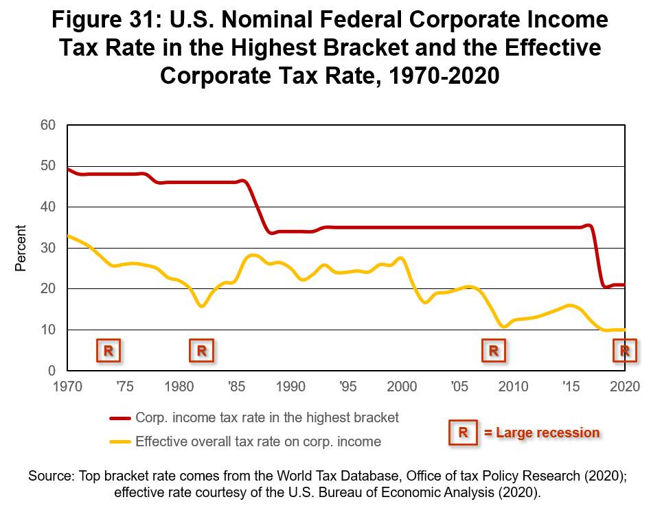
Figure 31 illustrates another #unholyunion win. America’s corporations are now ~90% of the way home to being U.S. citizens that don’t pay federal income taxes. I wonder when flesh and blood American citizens – you remember them, they’re the actual beings discussed in the U.S. Constitution – will get the same “lucky ducky” tax status as our more newly minted, superhuman peers? The #unholyunion brought us the tax trends shown in figures 30 and 31. Scoreboard. They’ve won going away since 1980.
Those tax cuts have undoubtedly contributed to America’s rising national debt. If we’d kept federal spending levels at the same ratio of GDP since 1970, America would still have a huge federal debt today because the massive tax cuts enacted since then have reduced the flow of resources into the government’s coffers.
It’s worth pointing out that recessions and declines in effective corporate tax rates go hand in hand. Look at the red boxed “R” symbols in figure 31. They correspond to America’s most recent four large recessions (defined as recessions that lasted at least a year and that saw at least a 2% fall in GDP). Effective corporate tax rates dipped during these downturns because corporate incomes tend to fall as customer demand dries up. The four recessions shown in figure 31, for the record, are the OPEC-induced recession that started in Q4 1973, the second oil shock that began in Q3 1981, the Great Recession that started in Q4 2007, and the COVID-19 downturn that hit in Q1 2020.11
These effective corporate tax rate dips have also contributed to the national debt. All four of these crises were answered by a round of countercyclical government spending (with a Keynesian slant). Less tax money coming in the door plus more government spending equals more public debt. The COVID-19 relief package that President Biden signed in early 2021, for example, had a $1.9 trillion price tag.12 A large chunk of those funds were or are being borrowed, meaning that the interest-bearing bonds sold to backstop those relief efforts squeeze out other federal budget priorities and bleed into the government’s red ink reservoir.
If the U.S. could find a means of reducing the severity and length of recessions, it follows, that would help turn the tide against our growing national debt problem. If the effective corporate tax rate also moved back up toward the red line in figure 31 – towards its position the early 1950’s, as figure 18 showed – that revenue could be channeled into paying down the national debt, too. Hold onto those two beers.
♦
Before shifting to federal government spending dynamics since 1970, it’s useful to underscore why the personal and corporate tax trends in figures 30 and 31 belong to the #unholyunion tradition. (If you don’t need convincing on this point, feel free to skip forward two subsections right now.) Ronald Reagan’s two huge rounds of personal income tax cuts were far and away the biggest changes to America’s income tax system since 1970. Two massive corporate tax rate cuts also came on the Reagan and Trump administrations’ watches. Nobody in their right mind – I’m looking at you Wanniski, Gilder and Ryan – would argue that those four watershed moments in U.S. tax history aren’t tied to the GOP and supply-side economics theory.13
Flat tax systems are like catnip to true blue l-f-lib ideologues. Milton Freidman flirted with the possibility of flat tax systems as far back as Capitalism and Freedom. America could rid itself of virtually all of its federal tax exemptions and loopholes and replace its current tax system with a flat tax model, he wrote in 1968, that would “be more equitable, vastly simpler, and far more efficient.”14 There’s the smoking gun. When President Carter asked Freidman for tax advice in the late 1970s, Friedman’s recommendation that Carter “Reduce the top rate of the personal income tax (from 70 percent) to 25 percent.”15 Flatness and more regressivity have been the hallmarks of the l-f-lib and GOP’s tax vision since 1980. Cut the top-end rates deeply and then either ignore or lie about what goes on with the rates at the bottom of socioeconomic pyramid.
As figure 30 showed, the Reagan administration almost realized Friedman’s 25% top marginal income tax rate wet dream. Friedman knew his plan would blow a hole in the federal budget if enacted, and that it would drive up the national debt to boot. He was okay with that. It was his lesser of three government evils vision. He wanted the federal government downsized from taxation and spending angles, and if that meant the national debt skyrocketed, so be it. Friedman rejected the “Latter Curve” because he could do subtraction: his deep tax cuts would yield less money to Uncle Sam. That was half the point. He wanted to “starve the beast”. The “Laffer Curve” implies it’s possible to starve the beast and give it more food at the same time. Can we pick one and stick with it please, fellas?
Latter-day Friedmanites have papered over this contradiction in supply-side economics theory. Like Mr. Mnuchin, they’ll happily talk out of both sides of their mouths on this point. In fact, they’ve generally sought to retain all of the corporate and personal income tax loopholes, shelters and deductions that have been carved and crammed into the IRS’s books since 1970 (shout out to the army of #unholyunion lobbyists that made that happen) and they still want a nominal flat tax rate system implemented – and they’ll regurgitate the zombie lie that their tax cuts will miraculously pay for themselves. No, no and no.
The Trump-Ryan tax cuts actually realized the #unholyunion’s ultimate vision of implementing a low, nominally flat corporate income tax rate system that allows big business to still avail themselves of all the special loopholes, shelters and deductions that they’ve helped carve into the IRS’s books in recent decades. America’s effective corporate tax rate has become inverted at the apex of the corporate food chain in some industries as a result. The bigger in scale that a C Corporation gets near the top of the corporate pecking order, it seems, the lower their effective federal income tax rate now often is relative to their mid-sized C corporation peers. Hold onto that beer, too, as we’ll shortly provide evidence that this is how things work.
Grover Norquist, meanwhile, has been wading further and further into the flat tax weeds for decades.16 He worked for the libertarian-leaning Harvard Chronicle while in college in the 1970s, and so was possibly a flat tax model fan before Reagan got to the White House.17 Norquist then became a U.S. Chamber of Commerce speechwriter in the early 1980s, and since the middle of that decade his ATR organization – besides being a front for Norquist’s lobbying work – has mainly sought to cut taxes as a share of GDP.18
When the Republican governor of Texas, Rick Perry, ran for president in 2012, Norquist was first in line to endorse Perry’s flat rate tax plan. Said Norquist about Perry’s vision regarding taxes, “I think the 20 percent rate – both corporate and individual – [it’s] very important to keep both rates the same…”19
Just as America was getting up off the mat after the Great Recession (and its associated plunge in effective corporate tax rates), that’s when another flat taxer, Michael Boskin, stepped forward to call for the elimination of all corporate taxes. Boskin was a Senior Fellow at the Hoover Institution at the time and an economics professor at Stanford. Latter-day l-f-lib’s like Boskin fly past Friedman’s nominal flat tax vision, which would have stripped out all of the deductions and loopholes in the tax code, and instead settle on a zero corporate taxes position. As Boskin put it in a 2010 Wall Street Journal op-ed, if America stopped taxing corporations that “would increase real GDP and future wages significantly. Junking both the corporate and personal income taxes and replacing them with a broad revenue-neutral consumption tax would produce even larger gains.”20
Nope. The Trump-Ryan tax cuts zeroed out nominal corporate tax rate progressivity in 2018 and crickets ensued from a U.S. wage hike angle. It looks like we’ve got to add another page to our l-f-lib zombie lie playbook. (GOP lawmakers, naturally, found it in their hearts to oppose increasing the federal minimum wage to $15 an hour in the 2010s.) For the government to help push up worker’s pay, runs the l-f-libs’ tortured logic, you don’t want to use the federal government’s power to make companies actually pay workers a living wage of, say, $15+/hour. The supply-side playbook necessitates that the federal government’s powers instead be used to funnel more money into the hands of corporate owners, and then we have to sit back and wait, pray, and chew our fingernails in the hope that these private parties choose to take that free cash and hire more workers and hand out raises to their workforces like Oprah handing out car cars. If those owners choose to pocket that that money instead, oh well. That’s just “market freedom.”
America is 0-4 on employee wage hikes after its last four rounds of big supply-side (regressive) tax cuts. A Pew Research Center review published in 2018, which used Bureau of Labor Statistics data, concluded that the average hourly wage in the U.S. fell from ~$24/hour in 1973 to ~$22.50/hour in 2018, using constant 2018 dollars.21 A similar study by the Congressional Research Service came out in late 2020 and it found that real U.S. hourly wages at the 50th percentile (the median wage for nonfarm, nonmilitary workers aged 25 to 64) increased by an average of 2.2% per decade between 1979 and 2019.22
The math and history are clear: the supply-sider’s regressive tax cuts don’t produce significantly higher frontline worker paychecks and may correlate with flat or falling employee pay. Yet Boskin and company keep spouting the zombie lie that their tax cuts yield higher employee wages. What the supply-sider’s regressive tax cuts have correlated nicely with is rising socioeconomic inequality. That’s of course the correct answer to the question, “Can you do basic math?” when top 1% company and top 1% family taxes are repeatedly cut while the rates of the median company and family are held roughly static.
A pair of nonpartisan research and advocacy groups, Citizens for Tax Justice and the Institute on Taxation and Economic Policy, released a study in early in 2014 that assessed the 10-K forms and annual reports of >275 Fortune 500 businesses between 2008 and 2012. That effort revealed that these businesses contributed 43% of all corporate federal income taxes paid over this five-year span; bear in mind that the companies in their study were all profitable (being profitable every year a was the key criterium for inclusion).23
The groups’ aptly named paper, “The Sorry State of Corporate Taxes”, revealed that just ten of the 288 profitable businesses considered paid an effective federal tax rate above 35% in the 2008-12 period. The effective rate for all companies in the study worked out to 19.4%.24 That’s ~6% above figure 31’s total corporate effective tax rate in that period but it’s also >15% below the corporate rate Boskin cited in his 2010 op-ed.
“The Sorry State of Corporate Taxes” additionally found that about a fifth of the large businesses in the study paid close to, but not over the 35% federal statutory rate that applied to them in those years. Another one-third paid a rate of <10% and 26 companies in the sample paid zero in federal income taxes through the entire five-year period.25 It was more accurate to say America’s largest corporations paid no federal taxes in 2008-12 than it was to claim they paid 35%+, as Boskin did.
The fact that Boskin cited nominal rates rather than effective rates reflects his l-f-lib bias. To have told the truth in his op-ed would have greatly weakened his case for zeroing out corporate taxes. More than a third of the largest corporations in America were well on the way to his goal when he penned the op-ed, and there’s no chance he didn’t know that fact. It’s about advantageous optics for l-f-lib’ers, not scientific or objective accuracy. It’s about winning in the real world, not truth.
We earlier suggested effective corporate tax rates have become inverted in many industries when the top dogs’ rates are compared to that of the median- and average-sized corporation. “The Sorry State of Corporate Taxes” delivers tangible proof that this is how the tax system has worked over the past 15 years.
Allow me to offer a side-prediction here: the typical U.S. worker will never get the “free lunch” pay hike that Boskin et all have tried to dangle in front their faces for decades via their supply-side tax cut red herrings. Trickle-down economics is a slot machine that’s never going to pay off for frontline workers. 99.9% of the #trickledownfaithful mob that’s milling around outside of Mar-a-Lago right now are never going to get into the neo aristocratic club. It’ll be easier for immigrants to navigate the path to citizenship on the southern border than it will be for the median U.S. worker to complete the Sisyphean #unholyunion maze that one day spits out massive pay hikes.
I went back and looked at the IRS’s SOI data from 1978-79 regarding corporate taxes. (This is the same data set I analyzed in chapters one and two.) That effort revealed that the top .23% of active corporations that had assets in those years (some ~5,700 U.S. corporations owned assets valued at >$100 million in 1978-79, which was the top asset class reported at that point) paid an average effective federal tax rate of ~23.5% on their taxable income.26 That’s close to figure 31’s overall effective corporate rate of ~24% in those years. I averaged two years of data to guard against the possibility that one of them was an outlier, and I chose this timeframe because it wasn’t a recession period and came before Reagan’s big round of corporate tax cuts. The SOI data suggested that progressivity wasn’t a pronounced feature of America’s corporate tax system even before Reagan got to Washington, DC, by the way.
SOI data also show that the top .23% of active corporations that owned assets in 2016-17 (some ~11,900 corporations had assets valued at >$500 million in those years) paid an effective tax rate of about 18% on their taxable income. That’s higher than the 13.5% shown in figure 31 in that period, but remember that a large share of SMBs switched over to the S Corporation form between the late 1970s to the late 2010s, making this something of an apples-to-oranges comparison regarding tax progressivity.27
My point is that SOI data suggest the effective corporate income tax rate that applied to the top ~1/4th of 1% of U.S. corporations, as measured by assets, fell by >5% between the late 1970s and the late 2010s. It’s an objective, scientific fact that C corporations’ effective rates have come down since the late ‘70s at the summit of America’s corporate pecking order. That’s an #unholyunion win. That’s a supply-side win. Their top guns have consistently pushed for it, and they got it. Next, we’ll check if #unholyunion forces have also been winning at the apex of America’s personal income tax ladder.
♦
A late 2019 op-ed in The New York Times came with the headline, “The Rich Really Do Play Lower Taxes Than You”. Its author, David Leonhardt, cited data collected by a pair of U.C. Berkeley economists, Emmanuel Saez and Gabriel Zucman. The professor’s research found that America’s richest 400 families had paid a lower overall effective tax rate in 2018 (their analysis included all federal, state and local taxes paid) than any other income group.28 The top 400 families’ rate in 2018 worked out to 23%. The group’s comparable rate in 1980, as calculated by the same economists, was 47% – which was itself down quite sharply from the comparable rate of 70% in 1950.29
That right there is smoking gun proof of the #unholyunion win streak. If that disgraceful reality pisses you off, and if you agree it’s wrapped up in the whodunit of America’s growing national debt problem, and if you agree our broader tax system shifts since 1970 have been a critical contributor to rising socioeconomic inequalities, and if you agree the effective tax rates on neo aristocratic families must go back up if America is going have a realistic shot at turning the tide on the national debt moving forward, then ding ding, winner winner, chicken dinner, you can skip forward to Book II here and now. The balance of chapter five and chapter six will do little but flog this same dead #unholyunion-branded horse until it’s an undifferentiated mass of blood, bone and dirt.
If we’re going to get our national debt back down to <33% of GDP, as it was in the 1970s, then the effective tax rates on America’s top 1% families and it’s top 1% corporations must move back up near the rates that existed in the 1970s. It’s not the only thing America has to reverse course on, but that change would certainly go a long way in steering the nation back towards the Arrow-Smith ideal.
Professor Saez’s and Zucman’s research also showed that America’s middle class and poor households haven’t seen their effective tax rates change much at all in the past two generations. These groups have served as an effective control group as America has experimented with the imposition of increasingly regressive taxes. There’s been some modest rate trimming among these social segments since 1970, as figure 30 implied, but the payroll tax has also gone up in this same timeframe – and that money is excluded from federal, state and local income tax calculations. “The combined result is that over the last 75 years the United States tax system has become radically less progressive,” summarized Leonhardt.30 True dat.
Here’s a great summary of the #unholyunion’s win streak regarding taxes, courtesy of Leonhardt’s late 2019 op-ed in The New York Times:31
But the second half of the 20th century was mostly a victory for the low-tax side. Companies found ways to take more deductions and dodge taxes. Politicians cut every tax that fell heavily on the wealthy: high-end income taxes, investment taxes, the estate tax and the corporate tax. The justification for doing so was usually that the economy as a whole would benefit.
That justification turned out to be wrong. The wealthy, and only the wealthy, have done fantastically well over the last several decades. G.D.P. growth has been disappointing, and middle-class income growth even worse.
The American economy just doesn’t function very well when tax rates on the rich are low and inequality is sky high. It was true in the lead-up to the Great Depression, and it’s been true recently.
Amen. Leonhardt is my brother from another mother. My long-winded, modest contribution to his op-ed is simply that the “low-tax side”, once you pull back The Wizard of Oz curtain, is a union of the proponents of laissez-faire libertarianism (spearheaded by Milton Friedman and George Stigler at the University of Chicago in the post-World War II generation) and members of the big business community and its attendant constellation of remoras (spearheaded in the 1970s and ‘80s by the USCC, Heritage Foundation, The Hoover Institution, AEI, Cato, ATR, The Federalist Society, and Koch brother-funded foundations) in whose direct financial interest it’s been to realize the fevered “small government, low tax, big outsourcing, big deficit” dreams of Friedman, Stigler, Wanniski, Gilder, Ryan, Hassett, Laffer, Norquist, Boskin et al.
The l-f-lib ideology has become a foil for the pro-inequality, near-term profit maximization schemes of the portion of the big business community that’s completely lost touch with Arrow-Smith ideal norms, with the importance of balancing near-term business profits and the long-term social interests of having a healthy, well-informed and expanding population as well as a highly-competitive business environment so America can remain ahead of most other countries from a socioeconomic standpoint. That’s how we win long-term. Having the latter half of that balance hold up is good for those same corporations in the long run, but their ledgers don’t contain that public good line item, so they behave as if it doesn’t exist and keep burning down the competitive infrastructure that served America quite well for most of the 20th century. Their alleged free lunch is a lie.
I’ve dubbed this pair the #unholyunion because the net result of their joint activities since the 1970s has been to drive up socioeconomic inequalities and then blame-shift the negative externalities and related fallout to any and all parties but themselves, regardless of the accuracy of their scapegoating efforts. When the math, science, logic and history inevitably contradict them, they grab a Trumpian bullhorn and repeat their zombie lie louder. They’ve mastered Friedman’s rewriting of history process and constantly douse themselves in buckets of Grassley, Harberger and Miller brand whitewash. They have low morals and no intellectual consistency. Whatever wins in that moment is their philosophy.
That’s why there are tens of millions of agitated Trump acolytes in the U.S. who were incapable of separating fact from fiction in the COVID-19 pandemic, when it came to voter fraud allegations in the 2020 election cycle, and in relation to the fascist coup attempt on the U.S. government on January 6th 2021. They’ve been lied to so successfully for so long by their alleged leaders that they can’t tell which way is up anymore. They’re incapable of acting in their own self-interest, or in the interests of their families or communities, when the head of their order tells them not to do so. They’re lost in a giant washing machine. They’re angry and in pain and, truth be told, deserve the sympathy and empathy of those who aren’t stuck in an endless spin cycle of l-f-lib and QAnon gobbledygook – a spin cycle that’s been supercharged by the derivative bets of #unholyunion-connected companies and the stacks of quarters they keep feeding to their remoras to keep the washing machine going full tilt.
Leonhardt came back for a second bite of the apple in April, 2021. In his “Corporate Taxes Are Wealth Taxes” article, he observed that America’s wealthiest individuals make most their money from ownership stakes in companies, not from salaries and bonuses, and so what’s happened over time to the capital gains tax and the corporate tax has been hugely beneficial to neo aristocrats’ bank accounts.32
Go back and look at figure 30’s yellow and blue lines. The max long-term capital gains rate has been lower than the middle-income tax bracket since the late 1990s. No wonder the effective tax rate at the top of America’s income ladder has become inverted. “The main reason why the U.S. tax system was so progressive before the 1980s is because of heavy taxes on corporate profits,” professor Zucman explained to Leonhardt in his April 2021 The New York Times piece.33 Reductions in corporate income and capital gains taxes have yielded a much flatter tax outcome nationally in recent decades, and at the apex of the income ladder an overtly inverted structure has appeared, turning the effective tax rate back down. That right there is a pro-inequality heat-seeking missile.
Mother Nature doesn’t allow the equivalent of declining personal or corporate income tax rates at the top of her pecking order in the wild. Enough with your Darwinian metaphors already. Your actions make clear that you don’t believe in them. Nature’s tax brackets all keep rising infinitely, as chapter two detailed. The #unholyunion hasn’t simply broken faith with the Arrow-Smith ideal, they’ve shattered natural law at the same time. The Arrow-Smith ideal hasn’t failed America, the #unhoyunion has failed the Arrow-Smith ideal.
I’ve dubbed America’s top 1% wealthiest families neo aristocrats for a reason: it’s true. The Forbes 400 list allows us to ground this notion practically. I reviewed this list back in 2008 but I suspect most years would tell a similar story going back to at least the year 2000. Four of America’s wealthiest ten individuals in 2008 were self-made billionaires: Bill Gates, Warren Buffet, Larry Ellison, and Michael Bloomberg.34 The other six were the Koch brothers and a gaggle of Walton (Walmart) heirs. The latter group inherited its billions.35
Not unlike England’s aristocratic class, against which America’s European settlers rebelled in the 1770s, it’s more accurate to say today that America’s richest families got their wealth because they won the genetic lottery than it is to say they earned their wealth due to their possession of tremendous minds or indefatigable work ethics. If you inherited billions of dollars and can live like a king or queen without needing to work a single day in your life, you’re an aristocrat in my book. What is America doing? The top of the Forbes 400 list says that we’re well on our way towards proving King George III right: aristocratic dominion is the correct and just way to run societies.
Prior the banking crisis of 2008-09, Democratic senators tried and failed to raise taxes on Wall Street’s hedge fund managers. That move, of course, would have helped fill in the regressive tax rate donut hole at the apex of America’s income ladder. Cue Stephen Spruiell, a 2002 Koch Summer Fellow who served as a press aide to then Representative Paul Ryan.36 The “idea that Congress can’t find offsets in the bloated federal budget and must raid Wall Street for more money is preposterous,” wrote Spruiell in National Review Online in 2007. “I know – no one deserves to have their taxes raised quite like these extremely well-compensated benefactors of the party that seeks to destroy them. However, as usual, it’s up to conservatives to know better.”37
There it is in black and white: a statement by a self-identified conservative in a self-identified conservative news outlet stating that their goal was to keep the Democrats from raising taxes on the hedge fund managers. They did it. They won that skirmish.
Th topic of mutual fund manager compensation came up in congressional testimony in late 2008 as well. A Stanford law professor, Joseph Bankman, a man whose CV doesn’t show a connection to the Hoover Institution, explained to those present how fund managers were compensated and taxed.38 “No one, to my knowledge, has ever seriously proposed a regressive tax, under which the rate drops as income rises,” Bankman told congress a month after TARP was passed. Yet “…that is exactly the effect of taxing the carry [the interest-derived profit generated by mutual funds] at capital gain rates. The fund manager who performs services is taxed at a rate of 15% on his carry, while the factory worker might be taxed at a rate of 25% on his overtime. A fund manager who in 2007 earned $80 million paid tax at a lower average rate than a high school principal who earned $80 thousand.”39
The regressive tax rate at the apex of America’s income ladder, which was noted by professor Zucman in 2018-19, was also present in 2006-07 and described by Bankman in Congressional testimony. That’s the mechanics of how hedge fund managers get paid and taxed. Allowing capital gains to be taxed at a lower rate than wages – wages that also have a large chunk ripped out of them in the form of payroll taxes for middle- and low-income earners – is an outstanding recipe for driving up inequality. Heirs to the Walmart fortune are overwhelmingly taxed on capital gains, not wages. Thank goodness the National Review Online was up there on the parapet to defend neo aristocratic interests.
In 2008, Grover Norquist published Leave Us Alone. The book should have been called Leave Neo Aristocrats Alone because his prescription for fixing what ails America has an incredibly pronounced pro-neo aristocratic bent to it. If one didn’t know better, one might think Norquist was a run of the mill corporate exec lobbyist. Norquist wants the capital gains tax, the dividend tax, and the “death tax” all vanquished.40 He hit the neo aristocratic tax repeal trifecta.
Norquist wants America to shift to a “FairTax” system. In Leave Us Alone, he wrote, if the U.S. were to tax goods and services at the point of consumption, “one time, at one rate, [roughly ~23%, and then pass a] constitutional protection against tax increases in the future”, then milk and honey would surely flow to all.41 It’s like he and Boskin had a Vulkan mind meld.
All flax tax models take a disproportionate bite out of the disposable incomes of poor people and middleclass wage earners, and from SMBs, then they do from rich folks and big businesses (due to living expense fixed costs, not to mention the tax loopholes that mainly help high-income individuals and big businesses). Flat rate tax systems are a recipe for rising inequality. Can you see the pattern yet?
Interestingly, a significant portion of neo aristocrats refuse to take the cheese, just as a portion of big businesses don’t want the l-f-lib tax vision realized, don’t support the broader ideology, and don’t feed the writhing moat full of remoras encircling Washington DC. Warren Buffett made headlines in 2006 when he acknowledged that he paid a ~17% rate on his income while his secretary paid ~30%. “There’s class warfare, all right. It’s my class, the rich class, that’s making war, and we’re winning,” said Buffett in an interview.42
If more neo aristocrats had a moral compass like Buffet’s, and if more big businesses grasped that our regressive tax structure is a Faustian bargain in the long run, then we could definitely start turning the ship of state more quickly back towards the Arrow-Smith ideal. That’s part of the answer, and a big chunk of the Arrow-Smith ideal’s implied solution to high inequality that’s the focus of Book II.
Beyond the direction that you think the capital gains tax rate should move next, where you stand regarding the estate tax is arguably the best litmus test for #unholyunion purity out there. The estate tax only applies to neo aristocratic families and households. As such, the #unholyunion’s leading remoras – the Heritage Foundation, Cato, AEI, ATR, Club For Growth, and others – have naturally come out against the tax.43 So much time and money has been spent muddying the waters on this topic dating back to the 1980s that a survey of Americans in 2002 found self-described conservatives were ~19% more likely to favor the estate tax’s repeal than the typical American.44 That’s straight up #trickledownfaithful washing machine magic.
The Trump-Ryan TJCA roughly doubled the estate tax’s exemption, as noted earlier. Cato’s director of tax policy studies, Chris Edwards, raced to the parapets to defend the change. “What would we rather Bill Gates do with his wealth? Go out and buy a bunch of yachts and houses or continue to grow and save his money?” wondered Edwards. “The rest of us should want that money saved and the estate tax works against that.”45
That statement is one of purest streams of disingenuous horseshit ever vomited onto a blank page. Given the l-f-lib master class in rewriting history that he’s taken, of course Edwards held Gates up as the face of estate tax payers even though he knows all too well that it’s the Koch brothers and Walmart heirs that are ideologically aligned with Cato on this point. Estate tax payers don’t face that kind of either/or choice regardless. The estate tax is a wealth transfer tax paid by an estate’s inheritors. The “death tax” is a carefully focus grouped #unholyunion spin phrase. It’s intended to misrepresent who pays the tax.
Estate tax payments may also be spread out over many years and pre-paid based on estimates.46 The tax effectively accelerates capital gains tax payments because most of what’s ultimately transferred turns out to be unrealized capital gains (stocks and bonds) that we’ve already made clear is what makes up a huge chunk of most net aristocrats’ wealth.47 Even Grover Norquist wrote that, with a modicum of estate tax planning, billionaires and their families can mitigate the taxes effects.48 Well, that won’t do, Grover.
Before Reagan’s first round of huge tax cuts, the estate tax rate was 70% on transferred fortunes above >$5 million. This rate came down to 55% circa 2000, and it’s 40% today (and the exemption floor has been raised over time as well). In of the early 2000s, the estate tax poured $30 to $40 billion a year into the federal government’s coffers. George W. Bush’s 2000-01 tax plan contained provisions that aimed to phase out the estate tax in 2010.49 The #unholyunion’s remoras naturally leaned into that full repeal effort. The story they pushed was that getting rid of the estate tax would help…family farmers.
Wow. That’s purer dogshit than what was scooped into Wall Street’s AAA-rated Atlas brand caviar tins that year. As documented in 2002’s Wealth and our Commonwealth, a pro-estate tax book coauthored by Chuck Collins and William Gates – Bill’s dad and, yes, Bill backed the book and is an estate tax proponent – farm-related assets were just .3% of total taxable estate value in 1998, and a farmer that the #unholyunion dredged up to pull an anti-estate tax publicity stunt in 2000, Lynn Cornwell, (1) was on a borrowed tractor when he rolled down Pennsylvania Avenue; (2) had collected >$400,000 in government farm subsidies in the preceding five years; (3) grazed his animals on federal lands at below-market rates.50 That’s the best example the #unholyunion could find. Putting lipstick on a pig indeed.
Democrats countered that the estate tax exemption could be raised a bit to make sure that farmers like Mr. Cornwell could be excluded from the tax, but GOP lawmakers held firm.51 That’s how you know who the Republicans’ and the #unholyunion remoras’ real clientele are: rather than raising the exemption to take the negligible number of family farmers off the estate tax hook, they held the line to ensure that the Walmart heirs and Koch brothers got theirs. Those people should have been on that tractor. Whatever works in the moment is what they do, no matter how inaccurate it is. They have no shame and low morals.
GOP lawmakers and the #unholyunion’s remoras haven’t given one wet fart in the past 50 years about the 401(K) and IRA transfer taxes that inheritors also have to pay, by the way.52 There’s another smoking gun. The estate tax repeal push has never been about principle. The overriding focus of the #unholyunion is to maximize neo aristocrats’ bank accounts. Their estate tax efforts prove that beyond a shadow of a doubt.
Progressives’ schemes to undo the #unholyunion’s regressive tax changes since 1980 have invariably been slapped with the “redistributionist” label to boot. Every tax code change is inherently redistributionist. When the proposed change is towards regressivity, though, the #unholyunion jumps over that term and instead says they’re “broadening the tax base”. Somehow that isn’t “redistributionist” and delivers more fairness by some intentionally (and necessarily) vague means. Their self-selected PR terms give away their biases too.
♦
Having thoroughly tied America’s increasing tax regressivity in recent decades to the #unholyunion bandwagon, let’s now switch gears to address something that none of us can get enough of: government spending. Let’s tie off the tax issue completely before moving on, however. Figure 32 shows the share of federal revenue by major source from 1970 to 2020.53 The figure is a bookend to chapter 3’s figure 20 that covered the same topic from the Great Depression through 1970.
The biggest relative grower in terms of tax revenues has been the payroll tax. The biggest relative loser has been corporate taxes. Tax shares have jumped around from year to year, mainly due to recessionary effects (the same four large recessions shown in figure 31 are also included here), but the long-term shifts in payroll and corporate taxes are obvious nonetheless.
Payroll taxes averaged around 28% of all federal taxes collected in the 1970s, per the OMB. Corporate taxes contributed 15% during that decade.54 By the 2010s, the comparable average shares were 35% and 9%, respectively. The net payroll tax share gain was 7.1% while corporate taxes lost 6.2%. (By the same measure, excise taxes lost 3.3%, estate taxes lost 1.2%, individual/household income taxes gained 1.8%, and customs duties/fees and other taxes gained 1.9%; estate taxes were arguably the biggest loser because, on a share basis, that this tax fell by two-thirds in this period. Bravo, team #unholyunion.)

The payroll tax (FICA) is a regressive tax. FICA is used to pay for Social Security and Medicare. That tax is withheld from the first dollar earned. FICA works out to 7.65% of annual earnings for most wage earners today but it’s capped at a moving wage level as well. In 2021, for example, the base wage limit on payroll taxes was ~$143,000. If you made $1 million in 2021, FICA’s bite was thus <1/10th of 1% of your gross pay. The big, growing yellow slice in figure 32 is a great example of another regressive tax.
The #unholyunion remoras have screamed bloody murder about the tens of millions of so-called “lucky ducky” households that don’t pay any federal income taxes, but they conveniently sweep the portion of those households that pay FICA under the rug when doing their math.55 It’s these types of biases that expose their true policy agenda and ultimate clientele. Their biases aren’t random. They all point in the same pro-inequality direction.
The blue layer in figure 32, federal excise taxes (typified by the gasoline tax), is also ignored when the remoras add up their “lucky ducky” taxes – as are state and local taxes – and excise taxes are another type of regressive tax.56 Poor families wind up paying a higher share of their income in excise taxes than neo aristocratic families.
About 4 in 5 of so-called “lucky ducky” households earned <$40,000 a year in the past decade or so, and single moms appear to be the largest slice inside this population. The other big “lucky ducky” slice is retirees living on Social Security.57 The #unholyunion’s remoras scream bloody murder about the 30% to 40% of U.S. households that haven’t paid federal income taxes in recent decades, but retired households are a big piece of the reason why that’s happened. What are retirees supposed to do, be forced back to work?
The double irony is that you’d think the #unholyunion and their remora cheer squad would be first in line to pat these “lucky ducky” households on the back. They have escape Uncle Sam’s evil tax clutches, no? That’s precisely where you’d like more families and business to wind up, right? Nope. They’ve got a Jedi mind trick ready to hide that colossal backflip: “Lucky ducky” households aren’t paying their fair share. Well, whaddayaknow? They flip their estate tax argument perfectly on its head and instead hold up “lucky ducky” households as a key rationale for “broadening the tax base”. These aren’t the droids you’re looking for.
The #unholyunion has managed “starve the beast” at the margins. As a share of GDP, federal taxes collected averaged ~17.5% in the 1970s, per the OMB. In the 2010s it averaged 16.5%.58 A 2008 study by the OECD showed that America’s total tax burden, as a share of GDP, was lower than the OECD average in 2005, and sharply below that of the European Union at that point.59 This “starve the beast” outcome must be credited to the #unholyunion. They’ve managed to pass regressive tax cuts repeatedly, yielding that outcome.
Now we’re ready to address government spending. Figure 33 separates federal outlays into six large buckets between the 1970s and the 2010s. Across these decades, on average, Social Security and Income Security gained about a 5% share of total federal outlays. The DoD and VA together lost ~12% of spending share. Interest on the national debt was actually squeezed by a fraction of a percent by this same measure.
The biggest gainer, at a whopping 18% rise between the 1970s and the 2010s, was Medicare and other Health-related program outlays. Spending in this bucket has spiked a staggering 852% using a constant 2012 dollars measure. This massive change between the 1970s and 2010 must be considered the headline takeaway from any examination of how U.S. government outlays have changed over time. What happened to healthcare?
Using the same constant 2012 dollars measure, Social Security and Income Security were the second largest gainer, at 230% growth across these two these decades. Interest on the national debt was third, at 158% growth. Figure 33’s other three buckets saw outlays rise by 20% to 80% each.
To be clear, outlays in every bucket rose even after the effects of inflation are removed. America’s population has expanded quite a bit since 1970 as well, making spending increases practically inevitable. In constant 2012 dollars, U.S. federal government outlays rose an average of 186% between the 1970s and the 2010s. The U.S. population increased by ~50% in this period, however, and ~60% between 1970 and 2020.

No matter how federal outlays are sliced and diced, they’ve clearly risen sharply on a per capita basis since the 1970s (although not on a share of GDP basis). Key drivers of this per capita spending rise have been (1) Medicare and other Health-related program outlays; (2) Social Security and Income Security program outlays; (3) payment on the national debt. It isn’t accurate to say that “welfare state” spending, such as on food and nutrition assistance programs that target low-income Americans have been the big drivers of federal spending increases.60 If you have that impression, you’re a victim of #unholyunion scapegoating.
Interest on the national debt has hovered in the ~7% of federal outlays range for the past half century, but that’s only because two larger buckets have grown a lot faster. Whatever angst and concern you may have about the national debt, put another way, you should reserve 6.9 times as much angst about what’s happened to Medicare and other Health-related program outlays, if you’re at all rational. You should also be 70% more pissed off about what’s happened Social Security and Income Security program outlays.
Numerous volumes have been written about how Medicare and Social Security function, and how these programs have changed over the years by experts and practitioners in the field that are far better versed on the particulars than I’ll ever be. Since we’ve half peeled the “What should be done about government spending?” banana, however, I feel compelled to climb out a limb in an attempt to lay bare the basic dynamic.
We’ll eventually circle back to America’s growing deficit problem. For now, we’re going to take a targeted detour into America’s healthcare system, as it intersects the federal government especially, in order to clarify why and how the yellow slice in figure 33 has grown so much faster than the rest of the federal government since the 1970s. I’m sure I’ve gotten some of the details that follow wrong, but I’ve done my best to follow the money and to use objective, science-backed resources to lay out the basic story as best I’m able. Let’s go peel back the Medicare and Medicaid bananas and conduct a basic health checkup on them. Can we find out what’s caused these programs to grow faster than the rest of the government, and perhaps how to stop it?
♦
The two big slices inside figure 33’s yellow slice are Medicare and Medicaid. Back in the 1970s, Medicare outlays appear to have been around ~52% of the yellow slice’s spending total while Medicaid contributed another ~30%.61 In the 2010s, the comparable shares appear to have shifted to ~54% and ~35%, respectively. Medicare and Medicaid thus went from about four in five dollars spent in the Medicare and other Health-related outlays bucket in the ‘70s to roughly nine in ten dollars spent in the 2010s.
Let’s tackle the bigger of the two programs first. Medicare is a national health insurance program that’s administered by a division of the Department of Health and Human Services (HHS) called the Centers for Medicare and Medicaid Services (CMS). The CMS is based in Baltimore, Maryland. Medicare was established in 1965 and, as of 2019, provided health insurance to 52.6 million Americans aged 65+ and 8.7 million disabled Americans under 65 years of age.62
Medicare has four parts: A, B, C and D. Part A pays for enrollees’ hospital and hospice care bills. Part B covers doctor’s fees and costs associated with other qualified caregivers and nonhospital service providers. Part C, today known as Medicare Advantage, allows beneficiaries to enroll in private health plans and get all of benefits of Parts A and B through those organizations (i.e., HMOs). Part D is the newest addition to the Medicare family and it covers prescription drug costs.
Let’s give each of these parts a once-over. Per 2018’s Medicare Trustees Report, which includes outcomes through 2017, Medicare’s payments are structured around two trust funds: the Hospital Insurance (HI) Trust Fund and the Supplementary Medical Insurance (SMI) Trust Fund. The HI Trust Fund is aligned with Medicare Part A. It helps pay for Medicare patients’ hospital bills, skilled nursing facility (SNF) care, hospice care, and for the care of blind people and other disabled Americans. As previously noted, Part A is mostly financed through payroll taxes, with a chaser of income taxes paid on Social Security benefits.63
Part B is aligned with the SMI Trust Fund. According to the same trustees report, Part B costs have increased by 5.5% per year in the preceding five years (2012-2017), a rate that’s well above the nation’s overall inflation rate.64 Hmmm. Let’s put a pin in that. Why are Part B’s costs rising faster than inflation generally?
Part B has also included Part D costs since 2006; the legislation that established Part D became law in 2003, but prescription drug benefits didn’t start flowing until ‘06. Most of what Part B covers is doctor’s fees, related lab tests and prescribed medical equipment. It’s mostly private companies that render these goods and services and bill the CMS. The SMI Trust Fund is paid out of the nation’s general federal tax revenue pool, partly offset by enrollee premiums. Part B outlays in 2017 came to $309 billion.65
Part C is an alternative to traditional Medicare (Parts A and B) that allows beneficiaries to enroll in privately run Medicare Advantage health plans. Part C was established in the 1970s and it remained a small part of the Medicare spending pie through the late ‘80s. The share of gross Part A and Part B spending that went to private Part C healthcare providers (i.e., HMOs, PPOs) in 2017 totaled $210 billion.66
An excellent history of Part C’s evolution was put together by a trio Harvard doctors and academics back in 2011. Their article, “An Economic History of Medicare Part C” laid out the reasons why Medicare Parts A and B got a Part C at all, and assessed Part C’s evolution through the passage of the Obama administration’s ACA in 2010. The authors of the article, doctors and professors McGuire, Newhouse and Sinaiko, noted that Part C was initially beefed up in the Reagan administration as a result of 1982’s Tax Equity and Fiscal Responsibility Act (TEFRA), which, from a Medicare angle, had “the stated dual aims of (1) giving beneficiaries a choice of health insurance plans beyond the fee-for-service Medicare program and (2) transferring to the Medicare program the efficiencies and cost savings achieved by managed care in the private sector.”67
TEFRA, in other words, gave HMOs a big shot in the arm. The change was a key element of the Reagan administration’s broader effort to privatize government services and deregulate whatever it could. In this sense TEFRA was an early salvo in what became the #unholyunion win streak. Enrollment in Part C edged up to 500,000 by 1985.68 Harvard’s McGuire, Newhouse and Sinaiko wrote that by the early 1990s, that still “only 2 to 5 percent of beneficiaries nationwide [were] enrolled in an HMO”, and that Part C enrollees in 1990 totaled just 1.3 million.69 Part C was very likely <5% of net program outlays that year.
HMOs nevertheless discerned how to make significant profits based on Medicare’s design in this timeframe. As Harvard’s trio of doctors and academics put it, based an “adverse selection” process, HMOs “could, and did, thwart Medicare’s savings aspirations.”70 A rationale for beefing up Part C fell by the wayside circa 1990. Providers of Part C “plans could not refuse to allow beneficiaries to enroll, but they could choose which counties to serve. Accordingly, the plans entered high-payment, high-cost—and therefore high-reimbursement—counties and expanded the choices there while at the same time avoiding low-cost counties.”71
Well, whaddayaknow? Instead of driving down costs, HMOs began pushing them up based on cherry picking counties that had younger, healthier populations and those that had above-average CMS reimbursement rates. HMOs left traditional Medicare holding the cost bag on relatively old, unhealthy, and lower reimbursement counties. That’s how their adverse selection process worked, and this approach yielded fatter HMO profit margins at the expense of Medicare’s intended privatization savings.
Once HMOs figured out this near trick, the land rush (and money grab) was on. By the mid-1990s, Part C enrollment was growing >20% a year.72 Part C had three million members in ’95.73 Part C also hit 8% of net Medicare spending that year.
HMOs, which blur the line between health insurance companies and medical care providers, got their own 6-digit NAICS code in this timeframe too: 524114. That code corresponds to the direct health and medical insurance carrier industry. If it sounds familiar that’s because it came up earlier in this chapter in the context of the finance and insurance sector’s relatively rapid growth. 524114 has been a huge piece of the sector’s non-Wall Street growth story since 1980.
Part C enrollment hit 5.2 million in ’97 and 6.3 million in ‘99.74 The CMS and the Clinton administration divined what HMOs were up to by then and sought ways to get Medicare’s ballooning costs back under control. I’ll defer to Harvard’s trio of doctors and academics once again. In the mid-1990s timeframe, they wrote:75
…Part C was costing rather than saving Medicare money. Despite taking 5 percent “off the top,” by paying plans 95 percent of a beneficiary’s expected costs, the limited, demographic-based, risk-adjustment system failed to compensate for sicker patients’ inherent preference for TM [traditional Medicare Parts A and B] and also allowed plans to profit from selecting healthier enrollees. The adverse selection in Part C was exacerbated by the ability of Medicare beneficiaries to enroll and disenroll in a Part C plan each month…
In sum, on average, healthy, low-cost beneficiaries were joining MA [Medicare Advantage] and reducing TM costs by less than the amount that Medicare was paying the plans. As a result, in the mid-1990s Medicare paid MA plans an estimated 5 to 7 percent more than it would have paid for those same beneficiaries in TM.
That 5% to 7% in additional cost per year adds up to a huge sum of money over time. MedPAC’s objective review of whether HMOs were actually saving Medicare money in 1998 showed that they weren’t. The program’s costs were going up 10% a year circa the mid-1990s and, for first time, concerns regarding the solvency of Medicare’s trust fund began to swirl.76 What did we get ourselves into with Part C?
In late 1997, President Clinton signed the Balanced Budget Act (BBA). That legislation cut CMS payouts to Part C’s HMOs, PPOs, and aligned contractors. The change was made with deep bipartisan support and was heralded as a deficit reduction measure because so much of Part B’s funds were being sucked out the federal government’s general tax pool (meaning the portion of Medicare costs that weren’t paid off each year through enrollment fees were being added onto the national debt through Treasury Bills sales).77
The BBA worked as advertised, and a portion of Medicare costs were indeed shifted back onto HMOs’ books. Many providers responded to the new red ink on their balance sheets by pulling out of unprofitable counties. Part C enrollment (and costs) nevertheless surged overall in the ‘90s. By the year 2000, 6.2 million Americans belonged to a Part C plan.78 Medicare Advantage also consumed 18% of net Medicare spending that year.
As HMOs left unprofitable counties, Part C enrollment dropped. Enrollment declined to 4.7 million by 2003, or 12% of all Medicare beneficiaries.79 By then, though, the Bush-Cheney administration held the reins of power in Washington, DC and was determined to give Part C another booster shot. The result was 2003’s Medicare Modernization and Improvement Act (MMA). That legislation reworked Medicare Advantage and created Part D. The “big government” payout floodgates got reopened.
Harvard’s trio of doctors and academics wrote that the “generosity afforded” to private plan providers based on the MMA’s changes were “in large part an attempt by the Bush administration and Congress to increase the private sector’s role in Medicare.”80 Well, mission accomplished, George:81
The MMA reversed the downward trends in the plans’ participation and enrollment through the strategy of raising plan payments. Medicare would now pay the highest of (1) an urban or rural floor payment; (2) 100 percent rather than 95 percent of risk-adjusted TM fee-for-service costs in the county; (3) a minimum update over the prior year rate of 2 percent or traditional Medicare’s national expenditure growth rate, whichever was greater; or (4) a blended payment rate update. These new rules translated into an initial average increase in plan payments of 10.9 percent, with some counties receiving more than a 40 percent increase.
Let’s slow our roll to fully appreciate the MMA’s impact on Part C. The legislation barely squeaked through the House, 216 to 215, with only nine Democrats voted in favor of it, and so any objective observer must conclude the party of fiscal responsibility here was the Democrats.82 The legislation was, and remains fully owned by the GOP, the Bush-Cheney administration, and their #unholyunion backers. The MMA abandoned any pretense of Part C saving the government money, a core selling point in the Reagan years. The MMA was privatization for privatization’s sake, systemic efficiency and federal deficit impacts be damned.
Medicare Part C went on another growth tear. Enrollees more than doubled between 2003 and 2009.83 The Bush-Cheney administration had rung one of the biggest dinner bells in U.S. history and all manner of companies bellied up to the “big government” bar for a bottomless feed at the taxpayer’s expense. This is my bottom-line point: the 1-2 punch of Reagan’s TEFRA and the Bush-Cheney administration’s MMA have done more to supersize America’s national debt than practically any other two pieces of legislation that one can point to since 1980. Go look back and look at figure 33 if you think I’m being hyperbolic.
Milton Freidman got to Washington DC armed with the radical notion of not caring about deficits if they stood in the way of his l-f-lib vision being realized. Bush II followed that up by hanging a big “Mission Accomplished” banner on Friedman’s plan in 2003. Said Bush II, effectively, “I see your indifference to deficits, and I raise you an open checkbook to private, mostly for-profit healthcare companies and prescription drug makers, Milton.” 34% of net Medicare spending got poured into Parts C and D by 2010.
I yield the floor to Harvard’s trio of unjaundiced doctors and academics once more:84
…in the years since the 2003 Medicare Modernization Act (MMA) was enacted, MA plans have been generously paid, resulting in expanded choice and enrollment (achieving the first goal), but costing Medicare more money than TM, an estimated $14 billion more in 2009 (and thus failing on the second goal)…
Not surprisingly, given the abandonment of cost control as a focus of policymaking under the MMA, from 2003 to 2010 the MA program continued to cost, rather than save, the Medicare program money. Since the passage of the MMA, MA payment rates have been much higher than TM spending as a result of the floors and the ratchet described earlier…The average MA plan payment has been estimated to be 12 to 14 percent over Medicare fee-for service costs each year since 2003, which in 2009 amounted to between $10 billion and $12 billion in additional Medicare program spending.
The MMA’s $10+ billion a year “privatization surcharge” as a result of Medicare Advantage excludes the other multibillion dollar pot of money opened up to prescription drug makers. “Big government” mission accomplished, George.
The ACA restructured Medicare Advantage payouts yet again in 2010, with the intent of bending Medicare’s cost growth curve back downward. The GOP and the #unholyunion lined up in opposition to the ACA with every fiber of their beings, and they still hate that legislation. One of reasons they do so is that they’re entirely in bed with whatever their campaign funders in the quasi-insurance HMO market want. They’ve got an “anything goes” policy worked out in that bedroom.
The ACA did what it was designed to do. Between 2012 and 2016, the first four years after the new Medicare provisions kicked in, Part C’s share of net outlays rose just 2%, to 27% of the program’s total costs. That’s less than half the share increase that occurred between 2007 and 2012 (Part C’s share of net Medicaid outlays in 2007 was 19%). The ACA’s broader impact on Medicare is clear from the CMS’ books. From 2003-2011, Medicaid spending increased by 8.6% a year on average, and then slowed to 4.4% a year from 2012-16.85
The Trump administration did everything possible to reverse course on this cost-saving, deficit reducing Part C change. CMS announced it was reviewing “uniformity flexibility” early in the Trump administration, and claimed that this process would allow “MA organizations the ability to reduce cost sharing for certain covered benefits, offer specific tailored supplemental benefits, and offer different deductibles for beneficiaries that meet specific medical criteria.”86 In mid-2018, the CMS’s uniformity changes went into effect.87
In Q3 2019, CMS crowed about the impact of these new changes. Trump himself was was pleased to have expanded “access to reduced cost sharing and additional benefits for enrollees with certain conditions,” according to a CMS press release, and the organization expected 1.3 million MA enrollees to take advantage of the uniformity changes in 2020.88 The administration also expanded “opportunities for seniors to choose Medicare Advantage plans that are providing new supplemental benefits, or extra benefits…” as well, and the CMS estimated that change would help 2.6 million enrollees in 2020. Another 1.2 million enrollees that year would also benefit from the “broader range of supplemental benefits that are not necessarily health-related but may help to improve or maintain their health.” Meals on Wheels inbound, grams!
HHS Secretary Alex Azar beamed with profligate, partisan pride. “This proven record of success—decreasing premiums in both Medicare Advantage and Medicare Part D—contrasts with proposals for a total government takeover of healthcare, which would destroy options such as Medicare Advantage that seniors increasingly choose.”89 CMS Administrator Seema Verma grabbed Azar’s mic, and added that the “proposals for more government through Medicare for All or a public option, would only harm the progress we have made to protect and strengthen the Medicare program for future generations.”
CMS didn’t only make uniformity changes that shifted billions of dollars a year back onto the government’s books during the Trump years. In September 2020, a CMS press release beamed about the organization’s 34% cut in MA premiums relative to their levels in 2017.90 That meant more “big government” spending.
Part C costs began rising at faster clip again in 2017. From 2017-19, Medicaid’s net annual costs rose by an average of 5.8% a year (with is still below the program’s 2003-11 growth rate).91 Partly due to the ACA – legislation that has withstood countless repeal attempts by the GOP and a bevy of challenges in the courts – the cost of Medicare Parts A, B and D grew at a reduced rate in 2017-19 (Part D costs fell by >$5 billion a year, to $70.5 billion net in 2019). Part C ended ‘19 at a 35% share of net Medicare outlays.92
The biggest fiscal story inside Medicare is that Part C has gone from a rounding error of net outlays in 1980 to 35% of total costs in 2019. Part D also went from a rounding error to 10% of total outlays in this timeframe. Parts A and B, traditional Medicare, have fallen massively as a share of outlays (Part A, excluding its Part C payout, lost 45% share of spending though this period, ending 2019 at 31% of net Medicare costs; Part B, excluding its Part C payout, remained flat at around 24.5% of total costs.) Part A outlays, adjusted to constant 2012 dollars, still rose 2.8x between 1980 and 2019, to >$182 billion, but make no mistake: the big banana inside the big banana in figure 33 is Part C.
So, what do we need to do to bend Part C’s costs back down? Hold onto that beer for a bit. Let’s give Medicaid a once-over first, and then we’ll come back to what to do to corral costs across these programs.
The HI Trust Fund is slated to go broke in 2026. Parts C and D have been sucking the guts out of the federal government’s tax coffers at an accelerated rate since the early 2000s, in no small measure because the MMA handed out the Part D entitlement without raising taxes to cover those payouts to prescription drug makers.93 The clock is ticking on Medicare’s solvency. There’s another giant sucking sound emanating from Medicaid, so let’s triage that patient and see if big businesses are the ones that opened up that gaping wound too.
♦
Ronald Reagan at first clamped down on Medicaid, as one might expect from a card-carrying member of the Milton Friedman fan club. The Omnibus Budget Reconciliation Act of 1981 (OBRA-81) trimmed Medicaid’s budget, and enrollment fell from 20.2 million in 1975 to 19.8 million by 1985.94
Medicaid was established in 1965 to deliver medical insurance coverage to Americans of limited means. Costs of the program are shared between federal and state governments. Most large Managed Care Organizations (MCOs) with Medicaid contrasts are for-profit companies, just as most of Medicare’s HMOs are for-profit businesses, but the government (the taxpayer) ultimately pays the bills.95 Medicaid is the second largest item in most state budgets after public education.96
Medicaid’s costs totaled $23.5 billion in 1980, and 55% of the program’s cost was picked up federally that year.97 Big line items included payouts to nursing care facilities and continuing care retirement communities (40%) and hospital payouts (37%). OBRA-81 gave states an option to wave the federal program and design and launch their own Medicaid MCO and community-based care programs.98 Many states have since gone down that path; as of 2014, most states had MCO contracts in place.99
The Reagan administration did an about-face on Medicaid spending during its second term. A CMS executive, Dr. John Klemm, summarized what happened in an article that was published in the year 2000. “With continuing improvements in the economy and concern among policymakers that OBRA-81 may have spawned program contractions that were too harsh, Congress embarked in 1984 on a series of Medicaid expansions that continued each year through the end of the decade. The expansions affected nearly the entire spectrum of Medicaid enrollees from infants, children, and pregnant women to low-income Medicare beneficiaries, and other aged and disabled enrollees.”100
Allow me to posit an unvarnished variant on Klemm’s assessment of what happened: after seeing their revenues fall in the wake of OBRA-81’s passage, the corporate half of the #unholyunion that had CMS contracts sicked their remoras on the ears of Reagan administration officials and GOP lawmakers, who then folded faster than Kenny Rogers with a bad hand.
The Medicaid gravy train picked up steam in 1985. Rather than tying services to AFDC eligibility, it was instead tied to federal poverty guidelines, which allowed in more enrollees. In 1986, Medicaid also began to cover the costs of some pregnant women and their newborns.101 The Medicare Catastrophic Coverage Act of 1988, passed just prior to Reagan moseying off into the sunset, per the CMS, “improved hospital and skilled nursing facility (SNF) benefits, covered mammography, and included an outpatient prescription drug benefit and a cap on patient liability”, and it started payouts to limit “spousal impoverishment”, which is when one half of a married couple is institutionalized and the other half lives in the community with limited means.102
An assessment by Reagan’s own CBO made clear that if the Medicare Catastrophic Coverage Act of 1988 was passed that it would drive up Medicaid’s costs, which is precisely what happened after it passed.103 Reagan, the alleged downsizer-in-chief, led the charge to supersize Medicaid on his way out the door.
Most of the changes to Medicaid that were made during Reagan’s second term didn’t have an immediate impact on outlays. “Many of the expansions introduced between 1984 and 1990 were subject to delayed effective dates or phase-in provisions,” wrote Dr. Klemm in his 2000 CMS article. “Average annual caseload growth, which turned positive again at 2.5 percent per year between 1984 and 1990, jumped to over 12 percent in the following 2 years and continued to increase steadily through the mid-1990s.”104
The Clinton administration’s 1996 welfare reform package severed the connection between AFDC/TANF and Medicaid that the Reagan administration had weakened. That change blew yet more wind into Medicaid’s growth sails.
MCO’s hit their stride in the 1990s. An HHS article from 2005 noted that, “An especially noteworthy development during the 1990s was the expanded use of managed care arrangements in Medicaid. In 1996, about 40 percent of Medicaid beneficiaries nationwide were enrolled in managed care; by 2003, the figure was ~59 percent.”105 The bill for Medicaid came to $71 billion in 1990 (57% of it federally paid), and the program served 25.3 million Americans.106 By ’95, recipients had spiked to 33.4 million; that nine million jump in beneficiaries was the single largest 5-year increase in Medicaid history.107 Program expenses jumped by >25% a year in the early 1990s as well, according to CMS records.108 “Big government” mission accomplished, Gipper.
Medicaid enrollees totaled 34.6 million in 2000. By 2010, 53.9 million Americans received Medicaid benefits and program costs had ballooned to $404 billion (68% paid federally).109 In 2019, 75 million Americans got health insurance through Medicaid.110 Outlays totaled $613.5 billion that year (63% federally paid).111
What has all that money been spent on? According to the Kaiser Family Foundation (KFF), a non-profit, non-partisan organization focused on national health issues, a big part of what Medicaid pays for is institutional and long-term community-based care. Per the KFF, “Medicaid is the primary payer for institutional and community-based long-term services and support – as there is limited coverage under Medicare and few affordable options in the private insurance market. Over half of Medicaid spending is attributable to the highest-cost five percent of enrollees. Medicaid bolsters the private insurance market by acting as a high-risk pool providing coverage for many uninsured people who were excluded from the private, largely employment-based health insurance system because of low income, poor health status, or disability.”112
Ahh, a hole exists in America’s private health insurance market. Private insurers want to adversely select away from institutionalized patients and, if possible, away from patients in the last year or two of their lives because that’s when their bills tend to get incredibly expensive. “Although only approximately 5.5 percent of enrollees utilize long term services and supports, these enrollees account for nearly one-third of all Medicaid spending on benefits,” the KFF article explained.113
In 2019, Medicaid MCOs collected 46% of all program outlays and similar managed care plans using other acronyms captured another 3%, per the KFF; nearly half of all Medicaid spending, then, went to MCO-type orgs that year.114 MCO’s are Medicaid’s equivalent to Medicare Part C’s HMOs and PPOs. MCOs were a rounding error of Medicaid program costs in 1980 but now absorb roughly half the program’s outlays. Let’s put a pin in those orgs. Rational deficit hawks must ask themselves, “Might we need to bend the cost curve down on Medicaid MCOs, particularly in the area of community-based care and assisted living facilities?”115
Medicaid has grown faster than Medicare over time. In constant 2012 dollars, Medicaid spending rose 694% from 1980 through 2019, to ~$556 billion. Comparable Medicare outlays went up 583%, to ~$590 billion. This dual-headed dragon has become a critical contributor to America’s growing national debt. These programs’ costs have grown faster than the nation’s population. Something inside those programs has inflated costs far in excess of the general inflation rate and population growth combined since 1980. What is that?
♦
Three of the biggest companies serving customers in the 524114 industry are UnitedHealthcare, Anthem and Centene.116 UnitedHealthcare delivered 80% of UnitedHealth Group’s $257 billion in revenue in 2020.117 The company, which trades under the UNH ticker, was #5 on the Q1 2021 Fortune 500 list. Anthem (ANTM) raked in ~$122 billion in 2020.118 It was #23 on the Fortune 500 list. Centene (CNC) collected $111 billion in 2020 and came in #24.119 If these corporations aren’t the three biggest players in the direct health and medical insurance carrier industry, they’ll certainly do until the biggest three turn up.
Let’s double-click on the histories and books of these companies to check if we can (1) get a clearer picture of what’s been driving up Medicare’s and Medicaid’s costs since 1980 and (2) check non-CMS data sources in an attempt to confirm if our preceding teardown of Medicare and Medicaid costs was on the right track.
An obvious takeaway of the histories of UNH, ANTM and CNC is that these aren’t organically grown bananas: all three of these corporations have been quite active in the M&A space. What became UNH was founded in Minnesota in the 1970s. That company grew significantly through ’84 and ran eleven HMOs in ten states at that point. UNH went public in ‘84. 1985 saw the acquisition of MetraHealth for $1.65 billion.120 In 2004, UNH bought Oxford Health Plans for $4.9 billion.121 It 2008 it was Sierra Health Services’ turn for $2.6 billion. In 2018-19, it was DaVita Medical Group’s and Equian’s turn, for $4.3 billion and $3.2 billion, respectively. There were other <$1 billion acquisitions along the way.122
ANTM was founded as a mutual medical/hospital insurance company in Indiana in 1946. It became the largest medical insurer in the state in the ‘70s. In 2001, the company demutualized and went public.123 In 2002, ANTM bought Virginia’s Trigon Healthcare for $4 billion. In 2004, WellPoint and ANTM merged in a titanic deal valued at $16.5 billion.124 (WellPoint had been California’s Blue Cross provider and had previously bought Missouri’s RightChoice Managed Care for $1.5 billion; between ANTM and WellPoint, the company offered Blue Cross and Blue Shield products in eleven states in 2004, making it the nation’s largest private health insurer.)125 In 2005, New York’s Blue Cross Blue Shield provider, WellChoice, slipped down the company’s gullet for $6.5 billion. In 2012, it was Amerigroup’s turn for $4.9 billion. ANTM tried to buy Cigna for >$54 billion in 2014, but that got antitrust regulator’s attention, and the deal was nixed.126
Centene was founded in Wisconsin in 1984 by a former hospital bookkeeper, Elizabeth “Betty” Brinn. The company remained a nonprofit Medicaid provider for many years. In 2001, the company managed three health plans that served 235,000 members; that’s the year Centene went public, on revenue of $327 million.127 CNC acquired Health Net in 2016 for >$6 billion.128 It bought Fidelis Care for $3.75 billion in 2017. In 2020, it acquired WellCare for $17 billion.129 In 2021, it was Magellan Health’s turn for $2.2 billion. CNC now serves >22 million members in all 50 states.
Have you ever read those Old Testament stories about who begat who, who begat who? The growth sagas of UNH, ANTM and CNC read like those tales in reverse: they’re all about who ate who, who ate who. I imagine George Stigler read these M&A deals to his grandkids around a warm hearth at night. None of these corporations would be anywhere close to the size they are now if the S-C-P era’s antitrust laws and policies had remained intact since 1980. The #unholyunion delivered us unto today’s UNH, ANTM and CNC.
In 2020, UnitedHealthcare’s Medicare & Retirement group served 5.7 million Medicare Advantage customers, 6.6 million Medicaid enrollees, and 4.4 million Medicare Part D beneficiaries, for a total of 16.8 million senior and public sector customers. The business unit generated nearly $91 billion that year.130 As UNH’s 2020 10-K filing notes, “As a percentage of the Company’s total consolidated revenues, premium revenues from CMS were 36%, 33% and 30% for 2020, 2019 and 2018, respectively…”131 Hopefully we can agree that UNH is currently about a third socialist by revenue.
In 2019-20, UNH’s medical care ratio averaged 80.1%.132 That means that roughly four in five premium dollars collected from the CMS and from private corporations went back out in rendered healthcare services and goods to covered patients. UNH’s overhead costs were thus ~20% of premium collected.
A review of UNH’s 1997 public filing shows that company revenue was $3.1 billion in ‘93 – so, like, wow on the company’s growth rate since then – and, by 1997, the company was serving 352,000 and 526,000 Medicare and Medicaid enrollees, respectively. “Premium revenues related to Medicare and Medicaid programs as a percentage of total premium revenues were 22% in 1997, 19% in 1996, and 22% in 1995,” states the ’97 filing.133 Medicare and Medicaid have become a much larger share of UNH’s revenues since the mid-1990s. That outcome is entirely consistent with the Medicare and Medicaid cost explosion story that we earlier traced using CMS records.
UNH’s revenue roughly doubled in 1996 alone, to $10 billion, based on its acquisition of HealthWise that year. UNH’s medical care ratio in 1995-96 averaged 80.2%, making the company’s overhead roughly ~20% of all premiums collected. UNH’s profit margin in those years averaged 5.4%.134
We earlier noted that 1997’s BBA undercut HMOs’ ability to run Part C plans profitably. UNH’s 1998 annual report make clear that the company’s “move to serve older Americans through Medicare health plans suffered from an executional setback”, and describes how the company was taking “dramatic actions to restore the profitability of our Medicare products in geographic markets that we believe can be served profitably and expanded as the privatization of Medicare evolves…”135
UNH lost $42 million on revenue of >$17 billion in 1998. The company blamed its Medicare contracts for that loss.136 Its annual report described how the company was “addressing our Medicare medical care ratio by altering benefit designs, recontracting with providers, and aggressively increasing both contemporaneous and retrospective claim management activities…” UNH’s Medicare medical cost ratio spiked 9% year-over-year in 1998, to 92% of premiums collected. That change pushed UNH into the red. The company couldn’t handle the narrowing of overhead costs to 8% of Medicare premiums. The company announced that October that it was withdrawing its “Medicare product offerings from 86 of the 206 counties we then served. The decision, effective January 1, 1999, affected approximately 60,000, or 13%, of our Medicare members.”137
Let’s slow our roll again. Clinton’s bipartisan, deficit-reducing BBA pushed UNH (and other HMOs) to be leaner and meaner – to be more efficient with taxpayer dollars – and UNH ran from the table faster than Kenny Rogers with a terrible hand. UNH wanted no part of 8% overhead cost margins. One may assume this is when the company shook its remoras awake and sicked them on the ears of GOP lawmakers.
UNH’s Medicare Advantage revenue kept declining through 2002. That outcome is also entirely consistent with what Harvard’s trio of doctors and academics reported regarding Part C’s trend in this period. UNH’s Medicare-derived revenues fell 21% year-over-year in 2002, to $4.8 billion (on total corporate revenue of $25 billion).138 UNH’s Medicaid business grew that year, though, so total CMS-derived payouts actually ticked up to 26% of corporate revenue. Net margins suffered a haircut; this metric dropped to an average of 4.7% in 2001-02. UNH executives were therefore no doubt thrilled to hear how the Bush-Cheney administration’s MMA plans were coming along in 2002. More higher-cost outsourcing, if you please.
ANTM’s growth story isn’t all that different. The company served 11.2 million Medicare and Medicaid members in 2020, which translated to 26% of the company’s membership base.139 That year’s 10-K filing notes how the ACA undercut its Medicare business line. “Medicare Advantage reimbursement rates will not increase as much as they would otherwise due to the payment formula promulgated by the ACA that continues to impact reimbursements…”140 Checkmark for decreased taxpayer costs and less federal debt.
Although about a quarter of ANTM’s total customers were Medicare and Medicaid enrollees in 2019-20, the company’s CMS contracts delivered a rather staggering 57% of ANTM revenue.141 No wonder ANTM is waist-deep in the “big government” feeding trough: far more money comes in the door per Medicare and Medicaid enrollee than from ANTM’s average business customer.
ANTM’s selling, general and administrative expense ratio, the equivalent of UNH’s overhead ratio, averaged 13.6% in 2019-20. ATNM appears to have been 6% leaner and meaner than UNH from this perspective; the ACA requires HMOs to pay out least 85% of premiums in large group plans, though, so an overhead ratio near 15% isn’t surprising – they’re basically meeting the minimum allowed by law.142
ANTM is a child of the Blue Cross, Blue Shield family tree. Two years prior to the company’s 2001 IPO, it paid a $42 million fine “to resolve an investigation into misconduct in the Medicare fiscal intermediary operations of Blue Cross and Blue Shield of Connecticut”, which ANTM had acquired. The Office of Inspector General (OIG) alleged that this ANTM subsidiary had been overcharging the CMS, and the company paid $42 million to make the case go away before it went public.143
ANTM isn’t the only Medicare HMO or Medicaid MCO to have been charged with CMS overbilling. In a 2011 whistleblower lawsuit, for example, a former UNH exec claimed the company routinely monkeyed with risk adjustment scores so that Medicare could be overcharged by “likely billions” of dollars; the DoJ later joined that case.144 What do you think the chances are that publicly traded, for-profit corporations push the boundary of what’s legal in their CMS billing processes? What do you think the chances are that this boundary-pushing has contributed to Medicare’s and Medicaid’s spiraling cost structure for decades?
ANTM’s operating revenue in 2001 was $10.1 billion. Like UNH, ANTM has gone on an insane growth tear since the late 1990s. The company’s Medicare and Medicaid contracts are a huge piece of that story. In 2001, CMS-derived revenues were <10% of ANTM’s revenue.145 The company has ridden the tiger of exploding Medicaid and Medicare costs right onto Fortune’s top 25 list. Congratulations…I guess? Allow me to wave a 57% socialist flag in your honor.
The company’s 2001 10-K noted that the BBA put a crimp in its Medicare business. Similar to UNH, ANTM pulled out of Connecticut at the start of 2001, “due to losses in this line of business in that market.”146 The research of Harvard’s trio of doctors and academics gets another green checkmark here. One may assume that whatever remoras ANTM owned in Washington, DC were shaken awake that year and aimed at anyone open to the ideas that wound up being in the MMA.
By 2005, ANTM’s annual report shows that the growth arrow was pointing back up. “We’re offering more choices for seniors, including Medicare Part D prescription drug coverage. As of January 2006, we are marketing Medicare products in all 50 states, and we expect between 1.5 million and 2.0 million Part D members this year…We also continue to develop new products for the growing senior market…”147 Ding, ding, ding! Winn winner, chicken dinner. The MMA feeding trough is back open for business. After the WellPoint megamerger, ANTM’s operating revenues spiked to a whopping $45.1 billion.
Centene has focused much more on Medicaid since its founding. In 2020, the company served 13.6 million Medicaid customers, ~4.7 million Medicare Part D members and nearly a million Medicare Advantage members. Close to 80% of Centene’s revenues in 2020 came from the CMS ($89.2 billion).148 Believe it or not, that’s down from 100% Medicaid-derived revenue in 2001, the year CNC went public. Centene’s revenues in 1999 were $201 million.149 Again, simply wow on the company’s growth rate over time.
UnitedHealthcare, Anthem and Centene together collected ~$249 billion from the CMS in 2020. That’s 51% of their combined operating revenue of $489 billion. These three businesses collected roughly 27% of all Medicare Parts C and D and Medicaid outlays in 2019. Again, simply wow on those titanic figures.
These three corporations, needless to say, aren’t the only ones serving Medicare and Medicaid beneficiaries. Other notable public, for-profit corporations in the 524114 industry are:
- Kaiser Permanente, which generated $88.7 billion in 2020
- Humana, which had revenues of $77.2 billion in 2020
- Aetna, a subsidiary of CVS Health (this is the one that got away from ANTM, courtesy of the DoJ); Aetna’s revenues, before it was gobbled up by CVS, came to $60.6 billion in ’18)
- Molina Healthcare, which generated $19.9 billion in revenue in ‘17.
Per the results of the Economic Census, the share of 524114 industry revenue collected by the four largest firms increased 13.4% between 1997 and 2017.150 The top for firms generated ~34% of direct health and medical insurance carrier revenue that year, up from 20.4% in ‘97. Industry revenues totaled $203 billion that year and zoomed to $856 billion by 2017.151 The Economic Census results square perfectly with what CMS’s data showed, and what public company filings have to say about industry trends: this market has exploded upwards on revenue over the past generation while also growing more concentrated at the market’s apex. Congrats #unholyunion, you got a double whammy win there.
Private nonprofits still play a key role in the delivery of Medicare and Medicaid services and products. That was how America approached healthcare broadly in the wake of World War II. Who in their right mind wants for-profit businesses standing between them and their physical or mental wellbeing anyway? It’s common sense that the profit motive will get in the way of patient health (and bank accounts) sooner or later.
Blue Cross plans emerged from experiments in Texas and California during the Great Depression that were designed to meet the health needs of desperate Americans at prices that they could afford. Every Blue Cross plan after World War II was backed by a nonprofit or mutual company.152 That was the stew from which Anthem and Centene emerged, became for-profit, went public, and went on their massive M&A tears.
Many “throwback” businesses in the 524114 industry still operate in the post-World War II mold. These providers have inherently reduced conflict of interest profiles with their customers and the taxpayer:
- BMC HealthNet Plan, which served 350,000 customers in and around Massachusetts as of 2014153
- CareSource, which serves two million members in Ohio and elsewhere; the company generated $8.8 billion in 2017
- Health Care Service Corporation (HCSC), a mutual company based in Chicago that serves 17 million Blue Cross and Blue Shield Association customers in five states (Illinois, Montana, New Mexico, Oklahoma, and Texas); in the first half of 2013, HCSC generated $11.1 billion154
- Independence Blue Cross, a subsidiary of Independence Health Group, which serves eight million members in Pennsylvania and adjacent states
- Tufts Health Plan and Harvard Pilgrim Health Care, which currently serves 2.4 million members across New England.
These nonprofits and mutual companies, and scores of others like them across the U.S., have also grown in recent decades, but at nowhere near the clip of the “big three” for-profit HMOs/MCOs described earlier. It’s hard to find OIG and DoJ cases alleging these nonprofits and mutual companies have been sticking it to the CMS from a billing angle. Might these two things be related? If you still aren’t sure if America’s high and rising healthcare costs are connected to the advent of supersized, for-profit HMOs and MCOs, then let’s go have a chat with Ken Arrow’s ghost and see if we can’t get you straightened out.
♦
Ken Arrow was an early advocate of single-payer, universal healthcare systems. In the early 1960s, before Medicare and Medicaid were established, but at a time when America was putting its healthcare system under a microscope and finding weaknesses, Arrow wrote a paper that described his vision for how to design a healthcare system that was reasonably consistent with the Arrow-Debreu model of general equilibrium.
His 1963 paper, “Uncertainty and The Welfare Economics of Medical Care”, starts with a G.E. theory sketch.155 If chapter two has grown hazy in your mind, I urge you to go read the first few pages of Arrow’s paper because it’s an excellent summary of the Arrow-Debreu model.156 The paper grounds the idealized model of efficient, highly-competitive markets in America’s imperfect healthcare system circa 1960.
Arrow dropped a genteel deuce in Milton Friedman’s lap after the model refresher. “Recently, M. Friedman has vigorously argued that the competitive or any other model should be tested solely by its ability to predict. In the context of competition, he comes close to arguing that prices and quantities are the only relevant data,” wrote Arrow. “But the price-quantity implications of the competitive model for pricing are not easy to derive without major – and in many cases, impossible – econometric efforts.”157 In contrast to G.E. theory, Arrow held, there’s no proof by which Freidman’s description of capitalist markets can be shown to be efficient, let alone used to make predictions that can be tested via scientific means because some variables in Freidman’s equations are missing, unknowable or utterly subjective.
Having tossed Friedman’s incomplete market description aside, Arrow acknowledges that healthcare is a tough market to analyze even through the comprehensive lens of G.E. theory because some inputs and outputs in healthcare are indeed quite difficult to pin down. There’s more risk and uncertainty in healthcare than in practically any other market, and private insurers contend with the higher risks and uncertainties in healthcare, Arrow wrote, by not covering certain patient types and population groups.
A “great many risks are not covered, and indeed the markets for risk-coverage are poorly developed or non-existent…[It] is impossible to draw up insurance policies that sufficiently distinguish among risks”, Arrow concluded.158 He was pointing here to the same hole in private insurance that came up in the KFF article touched on earlier. U.S. healthcare wasn’t Pareto optimal circa 1960, Arrow held, because the market suffered from “a reduction in welfare below that obtainable” for buyers as well as sellers.159
There’s a remedy for these types of market holes, however. When “the market fails to achieve an optimal state, society will, to some extent at least, recognize that gap, and nonmarket institutions will arise attempting to bridge it.” Preach, Ken, preach. “Certainly, the government, at least in its economic activities, is usually implicitly or explicitly held to function as the agency which substitutes for the market failure.”160 Arrow was now rubbing up against the shell of the market container described in chapter two and came to the conclusion that allowing holes in that shell was a really bad idea (they’re systemically inefficient and create non-Pareto optimal market outcomes); the government, or at best, non-profit orgs and/or closely regulated companies that act as stand-ins for the government, need to step up and completely seal that market hole.
“It may be useful to remark here that a good part of the preference for redistribution expressed in government taxation and expenditure policies and private charity can be reinterpreted as desire for insurance.”161 Go on wicha bad self, Ken. A pair of his colleagues, Buchanan and Tullock, wrote Arrow, “have argued that all redistribution can be interpreted as ‘income insurance.’”
Good governance is like a nonprofit insurance company that plugs society’s catastrophic risk holes directly or indirectly (on behalf of self-interested market agents inside its market containers). We’re back in the heart of chapter two here. Wise governments in market economies are there to mitigate, and to help societies avoid in advance all potentially catastrophic events and processes. Good governance is a life support machine. Wisely managed public goods help market economies flourish over the long-haul because they deliver services/goods that have positive systemic ROI’s and that are focused on services/goods that private market agents won’t self-fund because they too often lose money on them. These services/goods are smart long-term systemic investments but generally lose money. That’s the market hole.
Friedman’s laissez-faire model denies or ignores the multiplier effects of plugging those holes with public goods. That’s why the l-f-lib model of markets is incomplete.
“The welfare case for insurance policies of all sorts is overwhelming. It follows that the government should undertake insurance in those cases where this market, for whatever reason, has failed to emerge,” concluded Arrow in his 1963 paper.162 Amen. He acknowledged he was generally “chary” about making policy recommendations but then wrote the “present paper is intended to provide a framework” for exactly that. Arrow was attempting to put a thumb on the scale of Medicare’s and Medicaid’s basic design in this paper.
He recognized that conflicts of interest existed in America’s healthcare system. “In the plans of the Blue Cross group, there has developed a conflict of interest between the insurance carrier and the medical-service provider, in this case particularly the hospital.”163 While Blue Cross providers were nonprofits at that point, Arrow grasped that these companies would seek to retain as much money as possible on their books and thus try to minimize outflows to hospitals. Insured patients wanted to get better, presumably, and care little about the size of their ultimate hospital bills, but their insurers certainly do pay close attention to those costs.
Texas’ Blue Cross and Blue Shield plan had an overhead cost ratio of about 3% of incoming revenues in this timeframe.164 There are differences between pureplay health insurance companies and today’s Medicare Advantage HMOs and Medicaid MCOs, but it’s clear that the overhead ratios of today’s CMS contractors tend to be much larger as a share of premiums collected than the norm in the ‘60s. The conflict of interest issue that Arrow identified in his paper has become more acute in the intervening decades because the execs and boards of for-profit, public HMOs and MCOs are duty-bound to maximize investor/shareholder returns. (In its 2020 10-K, in fact, UNH crowed about how its stock price had widely outperformed the DJIA and S&P 500 since 2015, an excellent indicator of where its executives were focused.165 )
A significant portion of America’s healthcare industry has drifted from its nonprofit and mutual company roots, and from companies with overhead ratios in the ~3% of premiums collected range, into for-profit and sometimes publicly traded company territory with 15% to 20% overhead costs (and 4-6% profit margins). That change in the U.S. healthcare system must be considered a key suspect in the whodunit of rising Medicare and Medicaid outlays.166 There’s a massive cumulative fiscal difference between those models.
Arrow also noted that the admin cost ratios of group health insurance policies in 1958 was 9.5% of premiums collected (this share spanned for-profit and nonprofit group health policies) and the comparable ratio for individual health policies was much, much higher (51.6%). He concluded that this difference “implied enormous economies of scale in the provision of insurance”, which, in turn, was “a very strong argument for widespread plans, including, in particular, compulsory ones.”167 Bang. That’s a core single-payer, universal healthcare insurance rationale: due to economies of scale upsides, it’s cheaper per capita to cover everyone than it is to cover half, a quarter or a tiny fraction of a population with a network of fragmented plans.
“On a lifetime insurance basis, insurance against chronic illness makes sense, since this is both highly unpredictable and highly significant in costs,” Arrow continued. “Among people who have chronic illness, or symptoms which reliably indicate it, insurance in the strict sense is probably pointless.”168 He presaged here, by half a century, health insurer’s, HMO’s and MCO’s disapproval of the ACA’s mandate that these companies cover “preexisting conditions”. How’s that for predictive acumen, Milton? These companies, even in the days when nonprofits ruled the market, wouldn’t want to cover very sick people, Arrow saw, but if everyone was covered from birth the health insurance math works out as well as can be expected.
Would you like to guess what Medicare’s and Medicaid’s overhead cost ratios have been in recent years? As a share of expenditures, Medicaid’s admin/overhead costs in the 2012-19 period averaged 1.5%. The comparable figure for Medicaid was 4.6%. These “big government” programs have crushed private, for-profit HMOs/MCOs on their alleged efficiency home court. Medicare’s and Medicaid’s combined admin expense ratio was 2.9% in the 2012-19 period ($275 billion in admin costs on outlays of >$9.6 trillion).169
An obvious follow-on question: How can we get the CMS to sign contracts only with providers that have medical care ratios >90%? That change might push UNH and ANTM right back out of the Medicare and Medicaid marketplaces. Good riddance. ANTM’s profit margin in its government business averaged 3.4% in 2019-20.170 That’s all gone if the CMS raised its minimum benefit payout floor to 90% of premiums collected.
Centene might survive the cut. It’s average profit margin in 2019-20 was 1.7%. The company’s health benefits ratio was also ~87% in those years. If CNC tightened its belt by 3%, it could probably derive a narrow profit margin from its CMS contracts.171 It would return close to its nonprofit roots if it were to do so. Jump on in, CNC, the water’s fine. How is that not the patriotic – and patient-centric – thing to do?
Arrow’s idealized healthcare insurance system aimed at insuring “against a failure to benefit from medical care.” In the healthcare system he envisioned, “the payment to the physician is made in accordance to the degree of benefit…Under ideal insurance, medical care will always be undertaken in any case in which the expected utility…exceeds the expected medical cost…If we think of the failure to recover mainly in terms of lost working time, then this policy would, in fact, maximize economic welfare as ordinarily measured.”172
Let’s slow our roll again. Arrow believed the most efficient way to run healthcare was for insurance payouts to flow to physicians, labs, hospitals and so on if and only when the patients get better and ceased to need those companies’ services and goods. I’ll wait while you let that epiphany sink in.
Arrow’s healthcare system is, from the Arrow-Debreu model’s perspective, fundamentally different than the market for shoes, cookies and gardening services. In fact, he turns the traditional conception of markets upside down. Arrow’s health system has the government paying private (or public) healthcare goods and services providers when patients get better, and the faster patients improve and reduce or end their demand for healthcare-related products and goods, the more providers are paid for their efforts.
The goal is to give companies in healthcare a financial incentive to get their customers to stop using their services and goods. Can you tell where Arrow’s idealized insurance model parts company with how America’s healthcare delivery system currently works (including how Medicare’s and Medicaid’s benefit system is structured)? The existing business incentive structure is perfectly backwards. Let’s grab a needle and insert it right there. How can we shift America’s healthcare system towards one that prioritizes and incentivizes less use as it restores patients to the healthiest outcome possible as quickly as possible?
Arrow believed that nonprofits were the right vehicle to get there. As a signal to patients of a physician’s “intentions to act as thoroughly in the buyer’s behalf as possible, the physician avoids the obvious stigmata of profit-maximizing.” Well, that feels quaint, no? Due to the Hippocratic oath and other special ethical and moral obligations that doctors have – including their requirements for extensive schooling/training, having a government-approved license, and meeting ongoing educational goals – flows the “relative unimportance of profit-making in hospitals. The very word ‘profit’ is a signal that denies the trust relations.”173
Arrow was returning to his conflict of interest concern here. He’s saying for-profit firms in healthcare are unethical, and that for-profit businesses will be more at loggerheads with systemic efficiency than nonprofits (a consideration that Friedman et al deny or sweep under the rug as best they can).
“Price discrimination and its extreme, free treatment for the indigent, also follow. If the obligation of the physician is understood to be first of all to the welfare of the patient, then in particular it takes precedence over financial difficulties.”174 If you can’t make your patients better, doc, then you should suffer negative financial consequences. The patient is the one who decides if and when they’re better, and when healthcare providers are paid (by insurers or the government). If you’re a doctor or another provider who has consistently long patient recovery times for X, Y and Z conditions, then your payouts from the government and insurers eventually bleed out to zero. You’ll be doing pro bono work, like a lawyer with a good ethics.
The worst healthcare providers should get weeded out of markets that are optimized to get patients better quickly. What single-payer healthcare system around the globe operates most closely to Arrow’s model? Let’s grab another needle and jab it into a map of world where appropriate.
In a 2005 interview, Arrow said that healthcare reforms boil “down to the fact that the government is better than the private sector at keeping costs down for insurance purposes. This isn’t true in any other industry.”175 Arrow never came across evidence that dissuaded him from his 1963 view: market economies are better off if they leverage the economies of scale upsides inherent in single-payer healthcare systems. Those countries should cover all citizens from birth and invert the standard market’s incentive structure in order to minimize the use of healthcare services/goods while allowing quality providers to turn a modest profit.
That was Arrow’s idealized healthcare model. Health is a precondition for everything that people, and society at large, want to accomplish. Healthcare is a foundational element upon which the superstructure of society and all markets that offer optional products and services rest. Without a healthy citizenry, every society necessarily implodes. Healthcare is unlike the market for shoes, cookies and gardening services.
Ken Arrow passed away in 2017 at the age of 95. Let’s pause and give thanks to one of greatest economists the U.S. has ever produced. If we’re smart, we’ll follow Dr. Arrow’s 1963 prescription at some point. In the meantime, can we quantify the scale of the inefficiencies that are inherent in America’s current healthcare system?
♦
Virtually all developed countries have single-payer, universal healthcare systems. You don’t need to be a rocket scientist to figure out whether Ken Arrow’s math, science, history and logic were pointed in the right direction on healthcare. In 1980, OECD data show, the U.S. was on the high-end of member nations’ range in terms of spending. America was more or less tied with France at the time, with both countries spending close to 9% of GDP on healthcare.176 Some OECD nations spent as little as 5% on healthcare that year.
The U.S. has since pulled away from the herd. By 2011, for example, America spent 17.7% of GDP on healthcare and the average among OECD nations was <11%, and no other member nation was >12%.177
Per capita spending trends tell the same story. In 1980, we were at the high end of the OECD nation range, at a little over $1,000 spent per person on healthcare. By 2011, per capita healthcare spending in the U.S. came to $8,500 while the OECD averaged $3,300 (Norway was 2nd at $5,700).178 Fast forward to 2019. The U.S. spent $11,100 per capita on healthcare that year, per the OECD. Switzerland was second at ~$7,700.
As a percent of GDP, America was on top at 17%, Switzerland second at 12.1%, and Turkey was lowest at just 4.4% of GDP in 2019.179 Every OECD country considered, except the U.S., has a single-payer health insurance system and, in the cases in which healthcare facilities weren’t (and aren’t) government-run, their medical cost ratios are tightly regulated among the private contractors used (they have high payout floors).
What about health outcomes? If average life expectancy is used as the basic yardstick, then America measured 78.7 years in 2018. That placed us between Estonia and the Czech Republic. America came in at the high end of the lowest one-third of the OECD nation range.180 Belgium was in the middle, at 81.7 years, and Japan was highest, at 84.2 years in ‘17. If America spent a lot more per capita, or as a share of GDP on healthcare and got longer lifespans out the other side, that would be one thing. We didn’t and we’re not. We’re wildly profligate on healthcare spending and we live shorter lives. Thanks #unholyunion.
The math, logic, history and science of how to approach healthcare systems wisely – how to implement systems that best balance social (systemic) costs on the one hand and healthy patient outcomes on the other – is as done as the math, logic, history and science are on climate change. We know what we have to do. America must swallow it pride, kick the #unholyunion to the curb, and move down the single-payer health insurance track ASAP. The kicker is that we’ll start digging out of our federal budget hole to boot.
The #unholyunion will do everything it can, naturally, to block movement down this path. They’re all in on max systemic inefficiency because they conflate the maximization of shareholder/investor returns with efficient capitalism. They’re exactly wrong on that.
Chicago Schooler Richard Epstein put out a book in 1997 that laid out a clear l-f-lib vision for healthcare. He argued America’s inefficiencies in healthcare was a government problem, of course, not a private sector problem because it was government policies that exacerbated “problems of information, uncertainty and monopoly.”181 Epstein championed HMOs and the “unregulated provision of healthcare, which, in the long run, would guarantee greater access to quality medical care for more people.”182 Nope, nope and nope.
Epstein’s Mortal Peril: Our Inalienable Right to Health Care? is an l-f-lib screed worthy of inclusion in the Freidman, Hayek, Wanniski and Gilder canon. Epstein wanted Medicare and Medicaid repealed and the clock turned back to a time in which only the wealthy, and those with full-time jobs that offered solid benefits, had health coverage.183 1997, remember, was a few years after the Clinton administration tried, and failed, to get what became the ACA over the hump (’97 was also the year the BBA scaled back Medicare payouts).
“Hillarycare” was naturally slammed by the likes of the Heritage Foundation.184 The Health Insurance Association of America came out with its famous “Harry and Louise” ad at that time; that spot was designed to defeat the Clinton administration’s healthcare reform efforts, which would have covered more Americans at lower cost per capita. Over the #unholyunion’s dead body, “Billary”.
Milton Freidman couldn’t remain on sidelines. In the mid-1990s, in a letter to the editor in The Wall Street Journal, he wrote that America’s “health care costs would be more than cut in half as a fraction of GNP” if it followed his plan, which was to offer the citizenry medical savings accounts that were backed by “high-deductible catastrophic insurance” plans.185 Mmm, mmm, mmm. Can you smell the snake oil cookin’?
He elaborated on his position in an 8-page missive that came out in 2001, “How to Cure Health Care”. Per his tried-and-true approach, Freidman began with a basis in fact and then veered off the rails into pure l-f-lib fantasy. He analyzed data from 29 OECD countries between 1960 and 1997 and his conclusion was that the U.S. was indeed spending an absolute boatload on healthcare. “No other country in the world approaches that level of spending as a fraction of national income no matter how its medical care is organized.”186
Just so, Milton. “Direct government spending on health exceeds 75 percent of total health spending for 15 OECD countries. The United States is next to the lowest of the 29 countries, at 46 percent.” Hmm. So, America, an extreme outlier in terms of having a far less universalized health insurance system, was also paying a lot more on healthcare as a share of its GNP. Astute observation, Milton.
Then Friedman pivots to address health outcomes. “The least objectionable measure I have been able to find is expected length of life at birth…I have presented the data on the OECD countries primarily to document the two (related?) respects in which the United States is an outlier: We spend a higher percentage of national income on medical care (and more per capita) than any other OECD country, and government finances a smaller fraction of that spending than all except Korea.”187 Gotcha. After noting the U.S. was 20th out of 29 OECD countries considered on the life expectancy yardstick, he came back and underscored that our healthcare cost baseline was way above the norm.
Our health system, Friedman continued, is mostly one in which the “payments to physicians or hospitals or other caregivers for medical care are made not by the patient but by a third party – an insurance company or employer or governmental body…No third party is involved when we shop at a supermarket.”188 Uh-oh. Those truthiness rails may be starting to wobble. He seems to think healthcare is like the market for shoes, cookies and gardening services. He seems to think that because insurance is associated with healthcare that something fishy is going on. Nurse, I need 20 cc’s of liquid popcorn, stat.
Friedman noted that healthcare expenses are tax deductible in the U.S. for employers but not for employees, who could go out and buy their own health coverage. “If the tax exemption were removed, employees could bargain with their employers for a higher take-home pay in lieu of medical care and provide for their own medical care either by dealing directly with medical-care providers or by purchasing medical insurance.”189 Part of Friedman’s fix for what ails America’s healthcare system wasn’t to level the playing field between employers and employees by offering them both health insurance tax deductions, but rather to repeal the corporate tax deduction and turn all responsibility for getting healthcare back onto citizens (whether they have a job or not, and whether they’re able to pay for insurance or not).
Furthermore, the “Enactment of Medicare and Medicaid provided a direct subsidy for medical care…The lower the price, the greater the quantity demanded; at a zero price, the quantity demanded becomes infinite.”190 Now those truth rails are starting to fly every whichaway. If your home or apartment is insured against fire, does your demand for arson turn infinite? When’s the last time you got a healthy tooth yanked out of your skull because your insurance covered it? Insurance is a green light for infinite use in Friedman’s head. He thinks the healthcare market is very much like the market for shoes, cookies and gardening services.
The contrast between Friedman’s and Arrow’s model of markets is perhaps nowhere more starkly drawn and fleshed out in real world terms than in the area of healthcare. The vast majority of patients don’t want surgery, don’t want to take multiple prescription drugs, and don’t want to go to therapists or other practitioners indefinitely. Their preferred demand for healthcare is zero because anything above zero implies diminished quality of life. Why not design a health system that incentivizes providers to give patients what they want?
The revenue that goes to healthcare companies in the U.S. would surely fall if Arrow’s prescription was followed. The bank accounts of all other companies and all other citizens that aren’t involved in healthcare would also get fatter. From a systemic angle, that tradeoff isn’t close. That’s what all those OECD numbers cited earlier tell you. Other OECD nations have been reaping that relative systemic gain for decades and their citizens have lived longer to boot. Friedman et al refuse to see that math because their model doesn’t include systemic efficiency concerns. Their model has a gaping hole in it, a self-inflicted wound.
We obtain insurance, Friedman continued, “to protect us against events that are highly unlikely to occur but involve large losses if they do occur – major catastrophes, not minor regularly recurring expenses. We insure our houses against loss from fire, not against the cost of having to cut the lawn…[I]t has become common to rely on insurance to pay for regular medical examinations and often for prescriptions.”191
Friedman backed off of his infinite subsidy canard and instead argued that health insurance shouldn’t cover the costs of annual checkups, prescription drugs or other routine medical events. No, no and no. The problems with this are twofold. First, prescription drug costs were already high and rising when Friedman wrote his article in 2001. By 2016, per CMS data, 3.2 million Americans had hit the “catastrophic phase” in Medicare Part D costs, meaning that if these individuals had to pay for prescription drugs out of pocket, they’d be ruined financially.192 Friedman’s predictive power on prescription drug costs relative to lawncare costs was already off the mark in 2001 and this prediction has only gotten worse over time.
Second, preventing serious illness when possible, based on the early detection and treatments that are often linked to routine checkups, is the economically efficient as well as the moral thing do to. Freidman couldn’t see that because he failed to grasp that healthcare is different than the market for shoes, cookies and lawncare. From a systemic costs angle, you want healthcare checkups to be free because that helps people avoid more serious and costlier health outcomes down the road.193
Friedman circled back to a fundamental question near the end of his article. “What explains our higher level of spending? I must confess that despite much thought and scouring of the literature, I have no satisfactory answer.”194 Aww, Milton, say it ain’t so. The answer is staring you in right the face but your l-f-lib myopia – a condition that’s covered under most single-payer health insurance systems – prevents you from seeing it.
America’s half-socialized, half for-profit, Frankensteinian healthcare system has been delivering worst of both worlds outcomes for decades. We have an incredibly complex, extremely fragmented, and therefore overhead-boosting insurance system, coupled with the profit motive of potent market agents that wield oligopoly or “monopsony power” (and that have grabbed the ears of one half of America’s political duopoly and are holding on for dear life, society-wide efficiency outcomes be damned).195
“In terms of holding down cost, one-payer directly administered government systems, such as exist in Canada and Great Britain, have a real advantage over our mixed system. As the direct purchaser of all or nearly all medical services, they are in a monopoly position in hiring physicians and can hold down their remuneration, so that physicians earn much less in those countries than in the United States.”196 Stop buttering my muffin, Milton. You had me at “real advantage.” Now you’re saying if America adopted a single-payer approach, like Canada and Britain, that we could decelerate healthcare (and national deficit) spending by pushing the salaries of doctors, NPs and other providers back down towards the nonprofit compensation models that dominated in the 1960s? Where do I sign up, ol’ pal?
Friedman closed out his article by summarizing his policy advice:197
A cure requires reversing course, reprivatizing medical care by eliminating most third-party payment, and restoring the role of insurance to providing protection against major medical catastrophes. The ideal way to do that would be to reverse past actions: repeal the tax exemption of employer-provided medical care; terminate Medicare and Medicaid; deregulate most insurance; and restrict the role of the government, preferably state and local rather than federal, to financing care for the hard cases.
There it is in black and white: the l-f-lib’s “fix” for U.S. healthcare, although Friedman tacked on another band-aid in the form of his medical savings account idea. His mid-1990s boast, that if his vision were followed that U.S. could cut healthcare costs in half GNP as a share of was left on the cutting room floor. Even in Friedman’s wet dream vision of healthcare, notice, the government still had to care for the “hard cases”. The hole in the private insurance market still existed, even in the l-f-lib fantasy “fix”.
The Cato Institute dutifully followed Friedman down his bass-ackwards rabbit hole. Its director of tax policy studies, Chris Edwards, published a book in 2005 that laid out the libertarian thinktank’s plan in Downsizing the Federal Government. Like Friedman, Edwards paints a dire picture of U.S. healthcare cost trends over time, and then pivots to call for the scaling back of government involvement in healthcare in order to fix the problem. Do any of these guys ever consider a surprise twist ending?
Edwards’ approach assumed a ten-year phase in for his legislative cuts to Medicare and Medicaid. Compared to projected baseline costs through 2015, his budget cuts to these programs totaled ~$273 billion by 2015.198 “Medicare and Medicaid have grown rapidly as a result of both expansions in coverage and high medical inflation”, wrote Edwards in his book. “Health care inflation is driven by expensive medical technologies and by unconstrained demand for health care services.”199
We’ve already outlined how Medicare and Medicaid have expanded over time and linked those changes to rising enrollment totals and more aggregate cost, but let’s double-click on Edwards’ third cost driver and see if he was onto another important factor: price inflation within healthcare.
An OECD analysis of hospital costs in 2007 found that U.S. inpatient hospital stays were indeed >60% more expensive than the average of eleven other OECD nations (in Western Europe, plus Australia, Canada, Israel and South Korea) and the U.S.200 Hmm. Was Edwards onto something?
A JAMA Network article from 2016 found that widespread cost inflation in healthcare has been a key contributor to America’s rising healthcare outlays. The analysis considered spending levels in the U.S. and ten other high-income OECD countries (the UK, Canada, Germany, Australia, Japan, Sweden, France, the Netherlands, Switzerland and Denmark). The article’s authors concluded “health care utilization in the United States did not differ substantially from other high-income nations”, that the U.S. “spent nearly twice as much” on healthcare as these other countries, and that the “Prices of labor and goods, including pharmaceuticals and devices, and administrative costs appeared to be the main drivers of the differences in spending.”201
Edwards was right, it appears: America has been overpaying, by a lot, for healthcare services and goods. The cost of healthcare-related products and services is arguably the second biggest difference between our healthcare model and those of virtually all other OECD nations. I got you a needle. How can America curb its healthcare services and goods costs?
The JAMA Network article went on to note that, as of 2016:202
Administrative costs of care (activities relating to planning, regulating, and managing health systems and services) accounted for 8% in the US vs a range of 1% to 3% in the other countries. For pharmaceutical costs, spending per capita was $1,443 in the US vs a range of $466 to $939 in other countries. Salaries of physicians and nurses were higher in the US; for example, generalist physicians salaries were $218,173 in the US compared with a range of $86,607 to $154,126 in the other countries.
Gotcha. America should only allow nonprofits and companies that have low overhead (and high patient care payout) ratios to serve Medicare and Medicaid patients. We have to let Medicare negotiate with pharmaceutical companies on the costs of prescription drugs.203 Let’s find a way to get physicians’ salaries back down to the high end of the OECD nations’ range, stat, via new laws if that is what’s needed.
In an article in Missouri Medicine in early 2019, Arthur Gale, MD reviewed this JAMA Network study that focused on pricing in the U.S. healthcare system. In “It’s the Prices, Stupid: Why the United States is So Different from Other Countries”, Dr. Gale agreed America was paying “unjustified markups on goods and services by drug and device companies, insurance companies and hospitals.”204 Gale’s position was that:205
…control of pricing is far more important than all of the other measures that have been tried in the past to lower health care costs…
There are many proponents of managed care who do not want to hear this message. Managed care which got its start in the 1970s was introduced to the American public as the solution to high health care costs. The U.S. did not actually have high health care costs in the 1970s when compared to other OECD countries. Ironically costs rose only after the introduction of managed care. Business consultants, MBAs, and government agencies such as the Federal Trade Commission heralded managed care as a great cost saving strategy to replace the antiquated so called “cottage industry” health care delivery system which existed at that time. It turns out that the health care experts were wrong.
Gale was being genteel. What happened is that America had snake oil poured into its ears by the #unholyunion. They did this. They’ve been wrong. They don’t care if they’re wrong if keep winning, that is, if the profits of large private healthcare providers keep rising. That’s their North Star in a healthcare context.
Paging Dr. Gale for a second dose of tough love:206
All of these managed care schemes to lower health care costs basically serve as a smoke screen to divert attention away from the true cause of high medical costs – overpricing and profiteering…
The study by Jha [the JAMA Network article] clearly demonstrates that it is prices charged by hospitals, insurance companies, drug and device companies that explain why health care costs in the U.S. are so much higher than in OECD countries.
Managed care has been around since the Federal HMO Act was enacted under the Nixon administration in 1973. It has had over 40 years to prove that it will cut costs. As I have described in numerous articles written over the past 25 years it has increased not decreased costs.
Medicare and other government programs pay for over half of the health care in the U.S. Medicare is expected to go bankrupt in 2026. Businesses also are also complaining about the high cost of health care for their employees. Legendary investor Warren Buffet has called our health care system a tapeworm…
It is unlikely that the leaders of managed care will voluntarily change the present system. By maintaining the status quo they can continue to reap huge profits. Perhaps as a free and democratic nation we the people might begin to address and correct the problem.
Perhaps. Our democracy is in serious danger of sliding off the rails into fascism in the 2020s, however, thanks to the #unholyunion and their #trickledownfaithful voters that are stuck in one of the biggest spin cycles in world history.
Price gouging, and Dr. Gale’s “profiteering” among for-profit market agents, plus low patient care ratios by many large, private healthcare providers (America’s healthcare system has 2X the overhead of Canada’s healthcare system), equals America’s ongoing healthcare cost disaster.207
Chris Edwards acknowledged the price inflation problem but that quickly moved on with no analysis of what was driving it, or what to do about it. That’s because l-f-libs have no answer to those questions. He followed the Friedman playbook and swept the realities of price gouging under the rug because that didn’t fit his “downsize the government” argument. It isn’t patients that are demanding infinite healthcare as much as it’s the for-profit companies that have every incentive to bill the government (the taxpayer) for everything they’re allowed to do under the law. The corporate half of the #unholyunion in a healthcare context is the key problem, the tapeworm that Buffet referenced.
Edwards was honest enough in his book to call the creation of Medicare Part D “one of the most fiscally irresponsible laws ever passed by Congress”, but conveniently failed to mention that it’s his #unholyunion comrades and Cato funders that foisted that travesty on the American taxpayer.208 The budget deficit hole caused by Part D was and is the result of the GOP wanting to prop up pharmaceutical company profits; it was a “big government” socialist handout of their own creation.
Edwards’ ultimate “fix” is what you’d expect from Cato: the U.S. should (1) increase Part B’s patient premiums to cover 50% of total program costs, (2) increase Medicare Part A and Part B deductibles so that patients pick up still more of the bill and (3) convert Medicaid into a block grant that’s limited to inflation growth, thereby slashing future funding. That was Cato’s “fix” in 2005: strip ~$237 billion from these programs by 2015, and shift those costs back to patients and employers.209
Edwards ultimately moved about a quarter of the way towards Friedman’s position. It must have made for awkward moments at the #unholyunion’s 2005 Christmas Party. CNC couldn’t have been happy to learn that Cato wanted to shut the company’s Medicaid spigot off by 30% by 2015. UNH and ANTM execs probably weren’t thrilled to that hear that Cato wanted 12% of their Medicare revenues excised by 2015 either. Edwards’ proposed cuts would have been deeper than what Clinton’s BBA and Obama’s ACA actually delivered.
Edwards also gave Friedman’s health savings accounts a plug.210 To be clear, HSA’s have done exactly squat in the past two decades. In 2019, HSA balances totaled ~1.5% of U.S. healthcare outlays.211 So much for Friedman’s and Cato’s white horse charging from the sidelines in to save America from her high and rising healthcare costs.
We earlier implied several times that UNH, ANTM, CNC and other private insurers used lobbyists to advance their legislative wish list. We’ll put more meat on that bone next.
♦
Figure 34’s stacked columns show two things between 1998 and 2020: aggregate direct lobbying spending by UNH, ANTM and CNC, and the lobbying outlays of Washington, DC-based health insurance trade groups. These data are courtesy of the OpenSecrets database.212 There was a slight spending spike in the 2000-03 timeframe, the period in which the MMA sausage-making and Congressional passage process played out. A mild dip followed from there through 2007.
The Obama administration began ratcheting up its ACA discussions and actions in early 2008. The huge 2009 lobbying spike by health insurance trade groups is the elephant in figure 34’s proverbial room. If these groups were shouting down the BBA and talking up the MMA circa 2001, what these companies did in 2009 was more like what the Doof Warrior did in Mad Max: Fury Road – playing a flame-throwing electric guitar and screaming as he swung, suspended by chains before a militia wagon speeding through the desert. Suffice to say that giant spike of money was spent to defeat the ACA.

I’d be tempted to say UNH and ANTM put their money where their mouth was in 2009 but I’d be lying. The biggest healthcare insurance trade group in Washington, DC is America’s Health Insurance Plans, or AHIP. That trade group, which was funded by UNH, ANTM and similar providers through at least 2015, funneled >$100 million to the USCC in an effort to defeat the ACA in 2009-10.213 UNH, ANTM and aligned insurers didn’t want to be seen shoving their hands down on the legislative/political scale, so they stuffed a massive pile of cash down the USCC’ gullet to carry their biased water. We didn’t learn about that trick until 2012.
The ACA barely squeaked through Congress in 2009-10 on the wings of almost purely Democratic support.214
UNH, ANTM and aligned providers wanted what they wanted but they didn’t want to be seen wanting what they wanted. Let’s jab another needle in there. How can we update reporting regulations in a manner that spotlights the total lobbying outlays of every public company each quarter, including dollars they feed to external trade/industry groups? Let’s pour Brandeisian sunshine all over that process so that voters can see before they vote which companies are trying to do what in Washington DC.
From 1998 through 2020, UNH spent $74 million on direct lobbying, according to OpenSecrets. ANTM spent $79 million. CNC spent $26 million. Their aggregate lobbying payouts came to $179 million in this period. Do you think that much money might have bent several friendly political ears in Washington, DC?
Two other trade groups lobbied on behalf of health insurance companies in recent years as well: the BMA and PAHCF.215 The BMA pushes Medicare Advantage plans. It’s funded by the likes of UnitedHealthcare, Aetna and Humana.216 PAHCF is an alliance of hospital, health insurance, and pharmaceutical lobbyists that want to stop all movement down the single-payer healthcare track.217 Aetna is PAHCF’s biggest funder.218
In a letter to Connecticut Governor Ned Lamont in April 2021, CVS Health’s CEO, Karen Lynch, warned that moving down a single-payer health insurance system path would drive private health insurers out of the state. The CEOs of Anthem, Harvard Pilgrim Health Care and UnitedHealth Group co-signed the letter.219 At a minimum, it’s fair to say that the for-profit, publicly traded companies in the 524114 industry (and, yes, one of its large nonprofits) support PAHCF’s goal of forestalling a shift towards single-payer health insurance in the U.S. These companies are protecting their bottom lines and systemic efficiency is N/A. That’s low morals.
Peek back at figure 33. A central point of the massive detour that we’ve taken into the U.S. healthcare system is this: the fat yellow slice in figure 33 is the only one in which >90% of all spending goes right back out the door to private companies, and most of the big businesses in the “big government” healthcare feeding trough are for-profit, public companies. No other slice in figure 33 is like that. The federal government has effective cost controls on pretty much everything else it does, just as it has excellent cost controls on Medicare’s and Medicaid’s expense ratios. The U.S. government is not the inefficiency problem in our healthcare system. The problem is what the private companies are doing there: seeking to maximize their own profit at the expense of taxpayers and the national debt.
♦
If the federal government is like a super-potent mafia that’s out to steal Americans’ money, as #l-f-lib ideologues want you to believe, then this is a mafia that sure sucks at making money.220 The one thing we can say with great certainty about the federal government since the beginning of the 21st century, if not dating back most years to 1980, is that it loses money year-over-year. That’s the national debt: the side-effect of a “mafia” that’s apparently run by the most inept crooks in history.
In our RICO case against the federal government, is it possible to isolate another element in society that has direct and constant financial relations with the U.S. government and that’s wound up with a massive pile of moolah since 1980? #SiSePuede. If you work the means, motive and opportunity angles in this RICO case, you wind with a single prime suspect: a portion of the neo aristocratic class and the companies in which these individuals and families are the sole owners or largest shareholders. Follow the money. It’ll lead you right to the #unholyunion’s doorstep.
This same group has “starved the beast” to an extent through their successful regressive tax cut efforts. They’ve also managed to limit government outlays by getting their political allies in the GOP to cut the budgets of programs that they and their spin-cycled #trickledownfaithful voters find objectionable, regardless of the veracity of their claims about these programs.
As a share of GDP, America has fallen into the lowest one-third of OECD nations since 1995 in terms of government outlays (spanning federal, state and local government spending). American governance cost an average of 38% of GDP from 1995 through 2019.221 Only seven OECD nations were below us by this measure (South Korea was lowest at 28%), and 22 were higher (France was first at 55%). The #unholyunion has generally won on the “limited government spending” side of the ledger as well. Those two changes have pushed the nation in the direction of laissez-faire libertarianism.
Milton Freidman wanted government spending to max out at 15% of GDP.222 Grover Norquist appears to have initially been in the ~18% range, but then again, his goal of cutting government spending in half was so that it would be easier to then throttle it to death in a bathtub (i.e., no government spending, or full-blown anarchy).223
That gap between federal receipts coming in the door and outlays going back out the door, of course, is what produces a government’s annual surplus or debt. If you keep dumping large deficits year-over-year into a red ink reservoir, you’ll eventually wind up where America now stands: in a $28.5 trillion red ink hole.
Since 1970, in fact, the federal government has run a surplus in only four years – a brief window of “mafia” money-making opened up between 1998 and 2001 – but it’s otherwise operated at a loss every single year. In the 1950s, America’s federal deficit averaged .4% of annual GDP. It rose to .8% of GDP in the 1960s. To be clear, the entire national debt in 1970 was $371 billion.224
The deficit rose to 2% of GDP in the ‘70s, and then nearly doubled again to 3.8% during Reagan’s 1980s. Bush I and Clinton managed to trim that back to 2.1% in the ‘90s (by raising taxes enough to push the federal ledgers back into the black), but then the Bush-Cheney administration came along, reversed course with massive tax cuts, and the deficit edged up to 2.3% of GDP in the 2000s.225 The Great Recession hit late in the 2000s, and countercyclical spending during the Obama administration helped pushed that average higher, to 4.8% of annual GDP in the 2010s (with an assist from the Trump tax cuts).
If you look at the four major recessions since 1970, the deficit has spiked in every case because tax receipts go down while the economy shrinks, and the government has increased outlays to counter the effects of those downturns. (Keynesianism has outlasted all attempts by #unholyunion forces to restore the nation to a pure Hooverian mindset of laissez-faire indifference during downturns.) If you add up all the money between the green ribbon and the 0% line shown in figure 35, you get quite close to today’s total national debt.
We used to pay off war debts based on tax hikes (see the left-hand sides of figures 30 and 31 in this chapter, as well as chapter 3’s figures 17 and 18). America didn’t raise taxes to pay for its wars in Iraq and Afghanistan since 2000. Those costs – all $3.9 trillion of them, plus the hundreds of thousands of American lives lost and much of the resources spent to help heal the vets of those wars – went on the nation’s credit card.226
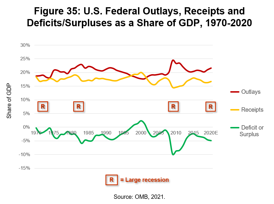
America’s effective tax rates are too low for the federal government to break even in a typical non-recession year. Our four major downturns since 1970 have further widened the gap between federal receipts and outlays. We’ve also fought two wars since 2000 without raising any taxes to cover their costs. If you’re at all serious about reversing course on America’s national debt, then all three of these changes need to be reversed. We need to rediscover how the federal government stayed out of substantive, prolonged deficits in the 1950s and 1960s, and move back toward those norms moving forward. Any such change will, of course, be fought tooth and nail by #unholyunion forces. They’ll once again reveal their true clientele in so doing.
Figure 35 also proves the “Laffer Curve” wrong. In the brief window in the late ‘90s in which the federal government actually ran a surplus, tax rates were higher than in the late ‘80s and tax receipts indeed went up. Whaddayaknow? The “Laffer Curve” was and remains a bad trickle-down economics joke.
I believe there’s a subtler but no less important fourth factor at work that’s contributed to the national debt since the 1970s: rising socioeconomic inequality. U.S. GDP growth has slowed since the #unholyunion began sinking its claws into the U.S. economy in the 1980s, a topic that we’ll explore in more detail in chapter six. A slowdown in GDP undercuts the amount of taxes coming in the government’s door.
America has been squeezing the base and the middle of its food chain for decades by way of the #trickledownfaithful prescription. An economy is a feedback loop between buyers and sellers. If big businesses are allowed to (or though inadequate competition can) price gouge middle class and poor families and mid-sized and small private businesses, then the net long-term result will be slower GDP as the toothpaste tube of near-term profit keeps getting squeezed to the top.
Congress’ Joint Economic Committee (JEC) connected the dots between high income inequality and severe downturns. The JEC’s 2010 Income inequality Brief noted that:227
[I]nequality has risen in recent decades and: High levels of income inequality may precipitate economic crises. Peaks in income inequality preceded both the Great Depression and the Great Recession, suggesting that high levels of income inequality may destabilize the economy as a whole. Income inequality may be part of the root cause of the Great Recession. Stagnant incomes for all but the wealthiest Americans meant an increased demand for credit, fueling the growth of an unsustainable credit bubble. Bank deregulation allowed financial institutions to create new exotic products in which the ever‐richer rich could invest. The result was a bubble‐based economy that came crashing down in late 2007.
Amen. The JEC effectively channeled John Galbraith on what helped make the Great Depression so devastating. Demand matters in a market economy. Unburdening top 1% companies and families from regulations and taxes does nothing to drive demand for goods and services in lower 90%+ of the food chain.
The Federal Reserve Bank of Dallas backed up the notion that severe recessions are the equivalent of levying an invisible tax on people. TARP and related TBTF-sustaining legislation could see a reprisal, the Dallas Fed warned in a 2013 letter, because America hadn’t fixed it high business world inequality problem:228
This special treatment [i.e., TARP] violated a basic tenet of American capitalism: All people and institutions have the freedom to succeed and also to fail based on the merits of their actions. In a way, the 2008–09 bailouts exacted an unfair and nontransparent tax upon the American people…Given…the tepid economic recovery and the collateral damage sustained, it is crucial to implement effective policies that avoid future episodes whose magnitude could exceed even the staggering costs and consequences of the most recent financial crisis.
America hasn’t since taken the Dallas Fed’s advice. The #unholyunion raced to the parapets and successfully defended the high level of business world inequality that existed before the ‘08 financial crisis, and so we’ve done is rearmed our high-inequality business world bomb.
My back of the envelope math suggests that America’s cumulative overpayment as a result of its Frankensteinian healthcare model since 1980 works out to about $14 trillion through 2021.229 If all that money had instead been used to pay down the national debt, it would be ~60% lower right now.
If we’d been punched in the nose by Bin Laden but then decided not to deliver a right cross into Saddam Hussein’s Iraq (for some still inexplicable and clearly misguided reason) in the 2000s, we’d be another ~$2 trillion richer. Let’s go ahead and knock that much off the national debt as well.
The downsides of the Great Recession, from the perspective of the federal government’s books, lasted from 2008 through 2014. If you use the average of the 2007 and 2015 deficits as a baseline and then calculate the net difference above that line, you get to ~$4.75 trillion in federal debt that was induced by the Great Recession alone. Let’s round up and posit that $5 trillion of the national debt is the result America’s last four severe recessions since 1970 – an extremely conservative estimate – and we’ll also include in that figure the negative multiplier effects associated with America’s high and rising level of socioeconomic inequality. All of the above can be laid 100% at the doorstep of the #unholyunion.
Those three pieces alone add up to $21 trillion, which is about three-fourths of America’s $28.5 trillion national debt at the end of 2021. How wrongheaded can you be? What will it take before America wakes up and makes a severe course correction back in the direction of the Arrow-Smith ideal and wikicapitalism? We’ll underscore just how divorced from reality the theories that underlie the #unholyunion crusade have proven to be in recent decades in this chapter’s final section.
References